If you are reading this, it means you have installed the HealthOne Pro Theme, our premium
HubSpot theme — so first of all: thank you for choosing us. In this document, we’ll walk
you through the basics to help you get started with your new theme.
Here’s what you get:
Once the theme is installed, all HealthOne Pro templates and modules will be available in
your HubSpot portal. When creating a new website or landing page, simply select
"HealthOne-pro" to browse the full list of templates. You can also use the search
function — all templates are prefixed with “HealthOne-pro” for quick access.
The theme contains a variety of website pages templates that serve as a good starting point
to build your well-designed, converting inbound websites.
Getting Started
Let’s get started with the basics. Once you successfully install HealthOne Pro HubSpot
theme from the HubSpot marketplace, you will arrive to a confirmation screen, and after a
few minutes (it can take up to 5 minutes for the theme installation to be completed), you
should be able to find your new theme on the Design Tools.
You can confirm this by going to Marketing > Files and Templates > Design Tools. Once here,
you should see something like this:
If you see the theme as you are seeing it above (note the name may vary), congratulations,
the theme has successfully installed.
Reinstall Theme
In rare cases, due to a common bug on the HubSpot marketplace, your theme may not arrive
successfully to your account.
If this happens to you, no worries, you just need to go to Asset Marketplace > Purchased, and
then select HealthOne Pro HubSpot theme, click Actions, and then Uninstall.
It will take a few minutes, and after that, you need to click Actions again, and then
Reinstall.
This will fix any issues that could have occurred. While this is a very unusual issue, in
case it happens to you, the solution is simple and easy.
Create a Child Theme
Once your new HubSpot theme is ready, it’s moment to clone it.
While this is not a required step, it is highly suggested to clone the HealthOne Pro
HubSpot theme before start using it.
installed themes from the HubSpot Marketplace are not editable (read-only), so you can
benefit from future updates and improvements. If you plan on making code changes, now is the
time to create a
child theme
and use that instead of the installed one for your website. Otherwise, you can use the
installed theme directly.
Theme Customization
Once your child HealthOne Pro HubSpot theme is ready, it’s time to start customizing it
to match your company brand styling.
In order to do this, you can go to Marketing > Website > Website Pages, and then click
Create > Website page. This will show you how to select a theme screen, select your
HealthOne Pro, and select any page you want to get started with (for example, the
Homepage).
Once you are editing the Homepage (or any other page), it will look something like this:
Once you are here, before you start editing the Homepage itself, let’s start with the
customization. Click Design > Edit theme settings, and you will be redirected to the
Theme settings screen, which looks like this:
In this screen you will have access to all global design customization settings of the
HealthOne Pro HubSpot theme. You will be able to select any of the sections, and start
editing right away.
We will cover the 3 main (Colors, Typography and Buttons) customization options, however,
feel free to dive into all the more advanced ones such as Spacing, Website Header,
Footer, etc.
Global Colors
If you click Global Colors in the customization screen, you will be able to see another
screen just like this:
You will see the colors divided into 6 different areas.we highly recommend you to update all
of the colors that match your brand style guide, so even the smallest color detail matches
your company brand.
Once you finish updating the colors, just click Apply changes.
Global Fonts
If you click Global fonts in the customization screen, you will be able to see another screen
just like this:
The Global Fonts contain the two parts the primary and secondary font
The primary font includes in heading
The secondary font includes in paragraph and body
Once you finish updating the fonts, just click Apply changes.
Spacing
If you click on Spacing in the customization screen, you will be able to see options:
Vertical Spacing: Set the default vertical spacing of section in px
Maximum Content Width: Set the default maximum content width of section
Once you finish updating the spacing, just click Apply changes.
Note
Don't be hassle the section setting have the custom spacing and max width of the
section, that will override these default spacing and content width
Text
Let’s change the typography now. Just as with the Colors, you just need to click Edit on the
Typography option, and you will arrive this screen:
Once you arrive here, you will notice the typography is customized in detail by Heading type,
Body Text and Link
This is to give you as much control as possible of the typography sizes, so your website is
as consistent and scalable as possible.
You will notice that you can easily choose between 100s of Font families, and this is because
HealthOne Pro HubSpot theme is integrated natively with Google Fonts, so you can use any
Google font without any extra work. Just choose your preferred font, click Apply changes,
and you are on the other side.
Font: Set the default font style, size, color, font weight and text
decoration of text
Transform: Optional, Choose the options from Capitalize, Uppercase,
Lowercase and None for text transform
Buttons
Click Edit on the Buttons tab, and you will arrive this screen:
Set the default button styles, You will notice that the buttons have a lot of customization
options, such as background color, font color, border style, padding and more, so you can
customize them as much as you want to fit your brand style guide.
Note
Don't be hassle we have given different styles of button, we have covered these
topics in Button-Module below
Form
Click Edit on the Form tab, and you will arrive this screen:
Set the default form styles from the above given options.
Title:
Color: Set the default color of form title
Labels:
Color: Set the default color of form label
Help Text:
Color: Set the default color of form help text
Button:
Color: Set the default form button styles,
You will notice that the buttons have a lot of customization options,
such as background color, font color, border style, padding and more,
so you can customize them as much as you want to fit your brand style guide.
Fields:
Placeholder:
Color: Set the default color of fields placeholder
Text:
Color: Set the default color of fields text
Background:
Color: Set the default background color of fields
Border:
Border: Set the default border styles, border width and border
color of fields
Corner:
Radius: Set the default corner radius of fields
Tables
Click Edit on the Tables tab, and you will arrive this screen:
Set the default table styles from the above given options.
Header:
Text:
Color: Set the default color of text
Background:
Color: Set the default background color of header
Body:
Text:
Color: Set the default color of text
Background:
Color: Set the default background color of body
Footer:
Text:
Color: Set the default color of text
Background:
Color: Set the default background color of footer
Cells:
Spacing:
Padding: Set the default padding of cells
Border:
Border: Set the default border styles, border width and border
color of cells
Header
Click Edit on the Header tab, and you will arrive this screen:
Set the default header styles from the above given options.
Notification Bar:
Background:
Color: Set the default background color of notification bar
Text:
Color: Set the default font color of notification bar
Top Bar:
Background:
Color: Set the default background color of top bar
Text:
Color: Set the default font color of top bar
Link:
Color: Set the default color of link of top bar
Hover and Active Color: Set the default color of hover and
active link of top bar
Main Header:
Menu:
Text:
Color: Define the default font color for menu text.
Font Size: Define the default font size for menu text.
Hover/Active Color: Define the font color for menu text on
hover and active states.
Dropdowns:
Text:
Color: Set the default font color of dropdown menu
Background:
Color: Set the default background color of dropdown
menu
Border:
Color: Set the default border style, color and width of
dropdown menu
Menu Item
Active Background:
Color: Set the default background color for active
dropdown menu item
Active Color:
Color: Set the default font color for active
dropdown menu item
Active Border:
Color: Set the default border color for active
dropdown menu item
Background:
Color: Set the default background color of main header
Fixed Header:
Menu:
Text:
Color: Define the default font color for menu text.
Hover/Active Color: Define the font color for menu text on
hover and active states.
Dropdowns:
Text:
Color: Set the default font color of dropdown menu
Background:
Color: Set the default background color of dropdown
menu
Border:
Color: Set the default border style, color and width of
dropdown menu
Menu Item
Active Background:
Color: Set the default background color for active
dropdown menu item
Active Color:
Color: Set the default font color for active
dropdown menu item
Active Border:
Color: Set the default border color for active
dropdown menu item
Background:
Color: Set the default background color for Fixed header
Mobile Menu:
Background:
Color: Set the default background color for mobile menu
Text:
Color: Define the default font color for menu text.
Font Size: Define the default font size for menu text.
Hover/Active Color: Define the font color for menu text on
hover and active states.
Display on Screen:
Screen Size (px): Set the screen width in pixels for
display visibility.
Footer
Click Edit on the Footer tab, and you will arrive this screen:
Set the default footer styles from the above given options.
Background:
Color: Set the default background color of footer
Text:
Title Color: Set the default color of title in footer
Color: Set the default color of body in footer
Link Hover Color: Set the default color of link hover in footer
Bottom Bar:
Background:
Color: Set the default background color of bottom bar footer
Text:
Color: Set the default color of bottom bar footer
Link Hover Color: Set the default color of link hover of bottom
bar footer
Border:
Border: Set the default border style, color and width of bottom
bar footer, Note, we recommend you to use only top side border as we have used
in the theme
Slider
Set the default Slider styles from the above given options.
Slider:
Arrow Navigation:
Width: Set the width of the navigation arrows.
Height: Set the height of the navigation arrows.
Icon: Set the color and size of the navigation arrows.
Background Color: Set the background color of the
arrows.
Border: Set the border properties of the arrows.
Corner Radius: Set the border-radius for rounded arrow
corners.
Hover:
Icon Color: Set the icon color on hover.
Background Color: Set the background color on
hover.
Border Color: Set the border color on hover.
Dots Navigation:
Width: Set the width of the navigation dots.
Height: Set the height of the navigation dots.
Space between Dots: Set the Space between dots.
Background Color: Set the background color of the
dots.
Border: Set the border properties of the dots.
Corner Radius: Set the border-radius for rounded dots
corners.
Hover/Active:
Background Color: Set the background color on
hover.
Border Color: Set the border color on hover.
Blog
Blog Post
Content
Container Width: Here you can change your blog post container
width.
Paragraph: Here you can change your blog post font size,
line-height and letter spacing in different device-width like Desktop, Tablet
and Mobile.
Progress Bar: Here you can Enable/Disable your progress bar and
customize it according to color and height.
Back To Top
The Last one of theme settings, Click Edit on the Back To Top tab, and you will arrive this
screen:
Set the back to top styles from the above given options.
Show Back To Top: Enable to use the back to top button in your website
Without Hover:
Icon Color: Set the icon color of back to top
Background Color: Set the background color of back to top
Border: Set the border style, border color and border width of back
to top
Corner Radius: Set the corner radius of back to top
Spacing: Set the custom padding and margin of back to top
Hover:
Icon Color: Set the hover icon color of back to top
Background Color: Set the hover background color of back to top
Border color: Set the hover border color of back to top
Header
The header is one of the most important parts of your website, so let’s continue with it.
This is the global header that appears at the top of your website pages, including your
company logo, menu, notification bar, etc.:
Just as before, if you go to edit the Homepage, or any other Website page, you will see
the option to edit the Global Header section, as you can see below:
Click “Edit module“, and you will be redirected to the Global Header section, so you can
start editing it. Let’s cover individually the Logo, Menu Links.
Logo
Let’s start with the easiest one, the logo.
In the Global header section, you will be able to just click on Header-Nevigation Main Header and then you will
see below the options to replace the logo or add the links...
We recommend you to upload the logo as SVG format (Scalable Vector Graphics) as it will be
super light and look perfectly sharp on every device. However, if you don’t have a vector
version of your logo, a PNG or JPG will work great too.
Menu Links
Once you finish with the logo, let’s continue with the Menu Links.
All the menu links are managed on the Navigation section within the Website settings on
HubSpot, so it’s very likely you are already familiar on how to edit them.
In case not, don’t worry, you just need to go to Settings > Website > Navigation. The screen
will look something like this:
In this section you just need to select your header (you can also create a new one), add your
menu links, and select it in the HealthOne Pro Theme header, as you can see below:
In order to edit the Global Footer section, you just need to edit any Website page,
scroll to the bottom, and you will find the footer.
Just click Edit Module, and you will be redirected to the screen to start editing the
footer.
Logo
Once you are in the Footer editor, you just need to click the Footer logo, and you will be
able to edit it and upload your company logo.
Just like on the header, we recommend you to upload the logo as SVG format (Scalable Vector
Graphics) as it will be super light and look perfectly sharp on every device. However, if
you don’t have a vector version of your logo, a PNG or JPG will work great too.
Regarding the Footer Links, you will notice these are same as the ones in the Header.
Select or Create a Menu which is applicable for your brand.
Blog
Lets learn how to set up the Blog and Blog Post template from the HealthOne Pro HubSpot
Theme on your website. You will be surprised of how easy it is.
Select Blog & Blog Post Template
To select the Blog or Blog Post template, you just need to go to Settings > Website > Blog >
Templates, and you will find 2 different drop down selectors.
One will choose the Template for blog posts, and the other one will choose the Template for
listing pages (aka, the blog) and click Save.
The module plays an important role in Hubspot Themes. In which you can easily add or
remove with drag and drop builder.
The HealthOne Pro Theme covers plenty of different kind of modules.
In which you can easily customize with the given options. There are so many options
available in the modules of HealthOne Pro Theme.
The place where the Theme modules take place are given below at a time of creating a
page.
There are many modules available for creating your website in HealthOne Pro Theme.
List of Modules
There are 24 Modules in our HealthOne Pro Theme.
Accordion/FAQ
Advanced Blurb
Bento Gallery
Blog Latest Post
Blog Post List
Case Study
Categories Post
Client Logo
Counter Number
Custom Button
Header Navigation
Hero Slider
Image Gallery
Multiple Progress Bar
Our Service
Patient Testimonial
Section Heading
Sidebar Recent Post
Social Follow
Steps Process
Tab Content
Team Member
Testimonial
Video Pop Up
Overview of all the Modules
It is not necessary to read this section, our modules is user friendly in which you can
easily understand each and every options and styles available in the module.
Don't Worry About how to use the modules, We will cover all the Modules in our
documentation. So you can easily use the modules in different environment of your
website or project.
Modules General Information
In the page editor you will see that all modules have two parts — Content and Styles:
Content:
The Content Part contains the content repeating fields, layout options and advanced.
Some modules does not have repeating fields.
Most of our theme modules have the common options of layout:-
The Scheme White Color option, if you check this checkbox the color of the module will
become white, This options is used for dark edition section.
Slider column selector or Grid column selector is the dropdown for selecting a number of
elements or items in a slider or row.
Heading Level dropdown is used for selecting the title heading tag from h1 to h6.
Button Style dropdown is used for selecting the style of various buttons, as we have
covered all the button styles in the Button-Module section of this document.
Show Icon in Button checkbox, if you check this checkbox the fa right icon will display
on button.
Advanced:-
We have also included two fields where you can specify an unique ID or a custom class
that will apply to this module wrapper. This may be useful to developers that want to
apply custom styles to a specific module, or if you want to add an anchor that will
scroll to your module:
Style:
The Style Part contains the various types of style options such as background layout,
spacing, border, box-shadow and font size, color, etc.
In HealthOne Pro theme the style have the options as per module content.
The accordion module can e.g. be used for frequently asked questions (FAQ).
Content Section:
Question: the “questions” of the accordion element
Detail: the “answer” of the accordion element
In style the open and close icon dropdown have the option values Plus-Minus, Arrow and Caret.
Select the values as per your requirement.
Style Section: (This all options are optional)
Box Container:
Custom Width: Enable to use the custom width for Container
Width: Enable the custom width if you required, after that you
will display the container width number field to add the custom container width of
the
module.
Alignment: Choose the content alignment options from left, center and
right
Border:
Border: Apply the Border style, color and width and also the sides
of border
Active Border Color: Apply the active border color
Corner Radius: Apply the corner radius of all the direction
Spacing:
Spacing: Apply the spacing for each elements
Accordion Question:
Font: Set the various font style, size, color, weight and
decoration for the question
Background Color: Set the background color in the question
Spacing: Set the margin and padding for the question
Active:
Font: Set the active font style for the question
Background Color: Set the active background color in the
question
Accordion Answer:
Font: Set the various font style, size, color, weight and
decoration for the answer
Background Color: Set the background color in the answer
Spacing: Set the margin and padding for the answer
Icon:
Font: Set the various font style, size, color, weight and
decoration for the icon
Active Color: Set the active color for active answer icon
Examples
Advanced Blurb
The Blurb Module is used for adding the Image, Text and Button.
Content Section:
Image: Select the image (Note: The Image field will
display if you have selected the Image in layout
Select Image/Icon)
Icon: Select the icon (Note: The Icon field will
display if you have selected the Icon in layout
Select Image/Icon)
Title: Title of Blurb
Description: Description of Blurb in rich text field
Button Label: Optional Button Label for blurb (Note:
This field will display if you have check the Button Required? field in the layout)
Button Link: Optional Button Link for blurb (Note:
This field will display if you have check the Button Required? field in the layout)
Layout:
Content Layout: Choose the options between Grid or slider to use in the
module
Choose Columns (Grid/Slider): Choose from multiple options from One
Column to
Four Column to display element in a row
Select Image/Icon: Choose the options between Image or Icon to use in
the
module
Image/Icon Position: Choose the options between Top of Left placement
of image/icon
Select Slider Navigation: Choose between arrows, dots, both, or none.
Note: This
field is visible only if the Content Layout is set to "Slider".
Button Required?: Check if required button in the blurb
Select Button Style: Choose between Solid, Link, or Outline button
styles.
Show Button Icon ?: Check if required button icon in the blurb
Heading Level: Choose from h1 to h6 for the title
Scheme Light Color: Switch between light and dark color scheme
Style Section:
Flex Column
Gap: Set gap between columns.
Image/Icon on Left:
Gap: Set the gap between the image/icon and the text.
Vertical Alignment: Set the vertical alignment of the
image/icon and text.
Box:
Text Alignment: Select the alignment of text
Select Background: Choose the background option between solid color
and gradient color
Background Color: Set the custom solid color background for
boxes, the color will display if you selected the solid color in
Select Background
Gradient: Set the custom gradient color, direction of color in
background for boxes, the gradient color will display if you
selected the
gradient color in Select Background
Spacing: Add the custom padding and margin
Border: Set the border styles, width and color
Corner Radius: Apply the corner radius of all the direction for the
elements
Box Shadow
Use Box Shadow: Enable for using the box shadow in element,
after the
enable all other options will display in this group
H Offset: The horizontal offset of the shadow. A
positive
value puts the shadow on the right side of the box, a negative value puts the
shadow
on the left side of the icon. Note:- If not require then set as 0
V Offset: The vertical offset of the shadow. A positive
value puts the shadow below the box, a negative value puts the shadow above the
icon
Note:- If not required then set to 0
Blur: Optional, The blur radius. The higher the number, the
more
blurred the shadow will be
Spread: Optional, The spread radius. A positive value increases
the
size of the shadow, a negative value decreases the size of the shadow.
Shadow Color: Set the color of box shadow
Box Hover:
Select Background: Choose the hover background option between solid
color
and gradient color
Background Color: Set the hover custom solid color background for
boxes, the color will display if you selected the solid color in
Select Background
Gradient: Set the hover custom gradient color, direction of color
in
background for boxes, the gradient color will display if you
selected the
gradient color in Select Background
Border: Set the hover border styles, width and color, select the
same border width in which you have selected in box border
Box Shadow
Use Box Shadow: Enable for using the box shadow in element,
after the
enable all other options will display in this group
H Offset: The horizontal offset of the shadow. A
positive
value puts the shadow on the right side of the box, a negative value puts the
shadow
on the left side of the icon. Note:- If not require then set as 0
V Offset: The vertical offset of the shadow. A positive
value puts the shadow below the box, a negative value puts the shadow above the
icon
Note:- If not required then set to 0
Blur: Optional, The blur radius. The higher the number, the
more
blurred the shadow will be
Spread: Optional, The spread radius. A positive value increases
the
size of the shadow, a negative value decreases the size of the shadow.
Shadow Color: Set the color of box shadow
Icon
Width: Set the custom icon width in px as per your requirement
Height: Set the custom icon height in px as per your requirement
Color: Set the icon color
Hover Color: Set the icon hover color
Box
Width: Set the custom icon box width in px as per your
requirement
Height: Set the custom icon box height in px as per your
requirement
Background Color: Set the background color for icon box
Border: Set the border styles, width and color
Corner Radius: Apply the corner radius of all the direction for
the
icon box
Hover Background Color: Set the icon hover Background color
Image:
Width: Set the custom width of image
height: Set the custom height of image
Corner Radius: Set the custom corner radius of all directions in px
for image
Title
Font: Set the font style, font size, color, weight, text-decoration
of title
Spacing: Set the custom padding and margin of title
Hover Color: Set the font hover color of title
Use Gradient: Enable for using the gradient color in
title
Gradient: Choose the directions from dropdown and add as much
color you want
Description
Font: Set the font style, font size, color, weight, text-decoration
of description
Spacing: Set the custom padding and margin of description
Hover Color: Set the font hover color of description
Button:
Font: Set the font style, font size, color, weight, text-decoration
of button
Background Color: Set the custom background color of button
Spacing: Set the custom padding and margin of button
border: Set the border styles, width and color for button
corner Radius: Set the custom corner radius of all directions in px
for button
Hover Style:
Background Color: Set the custom background color of button on
hover
Font Color: Set the custom text color of button on hover
Border color: Set the custom border color of button on hover
Examples
Bento Gallery
Content is divided into multiple cells, arranged in
rows and columns,
similar to a grid.
To set bento grid columns and rows read
the below detail:
Setting Columns (Layout/Grid column)
To define the columns in your grid.
Depending on your layout requirements, you can increase the number of columns up to
a maximum of 12.
Defining Row Height (Styles/Grid Box/Height)
to set the minimum and maximum height for the rows.
Each row will have a minimum height of, for example, 145 pixels and will
automatically expand to fit the content.
Positioning Columns (Content/Setting/Column start OR Column End)
to control the placement and span of items across columns.
For example, grid-column: 1 / 3; places an element starting at column 1 and ending
at column 3, meaning it will span two
columns (from column 1 to column 2).
When positioning the next element, ensure it starts where the previous one ends. For
instance, if the first element ends
at column 3, the next should start from grid-column: 3.
Positioning Rows (Content/Setting/Row start OR Row End)
to control the placement and span of items across rows.
Similar to grid-column, grid-row: 1 / 5; will place the element starting at row 1
and ending at row 5, spanning four
rows.
Ensure the placement of rows aligns properly, just like with columns. If one element
ends at row 5, the next should
start from grid-row: 5.
Content Section:
Image: Choose the background image for background for
Grid box.
Icon: Select the icon from the icon picker to use in the Grid Box
Title: Add the title of the element
Short Description: Add the Description of the element
Setting:
Column start: To add a numeric value for the grid-column-start
property in CSS, you can use a specific number to define the starting
column of a grid item.
Column End: To add a numeric value for the grid-column-end
property in CSS, you can use a specific number to define the ending
column of a grid item.
Row start: To add a numeric value for the grid-row-start
property in CSS, you can use a specific number to define the starting
row of a grid item.
Row End: To add a numeric value for the grid-row-end
property in CSS, you can use a specific number to define the ending
row of a grid item.
Layout:
Grid Column: Choose from multiple options from Column 1 to
Column 12 to define the columns in your grid.
Heading Level: Choose from h1 to h6 for the title.
Scheme Light color: Switch between light and dark color scheme
Advanced:
Custom Css ID: Add custom id for module
Custom Css Class: Add custom Class for module
Style Section:
Layout:
Max-width: Set the use content max-width in px of the module.
Alignment: Choose the module alignment options from left, center
and right.
Grid Box:
Height: to set the minimum and maximum height for the rows.
Gap: Set gap between columns.
Spacing In Mobile View: Set the custom padding and margin of the
grid box for mobile display.
Corner Radius: Set the custom corner radius of all directions in px
for box
content:
Spacing: Set the custom padding and margin of content
Spacing In Mobile View: Set the custom padding and margin of
content in mobile view
Image:
Spacing: Set the custom padding and margin of iamge
Overlay Switch between use overlay or not
Color: Set the overlay color over image, this option will
display if you chech the use
overlay field
Corner Radius: Set the custom corner radius of all directions
in px
for image
Icon
Width: Set the custom icon width in px as per your requirement
Height: Set the custom icon height in px as per your requirement
Color: Set the icon color
Title
Font: Set the font style, font size, color, weight, text-decoration
of title
Spacing: Set the custom padding and margin of title
Description
Font: Set the font style, font size, color, weight, text-decoration
of description
By following these points, you can create a flexible and visually organized Bento
Gallery
layout that adapts to different
content and design needs. This approach allows for creative use of space and an
engaging
presentation of elements within
the grid.
Blog Latest Post
The Blog Latest Post Module can be used for listing your blog post in a slider view.
Content Section:
Blog Id: Select the Blog
Post Count: Select the number of blog posts to display
Post Description: Choose whether to display the post description or
not.
Layout :
Layout Style: Choose from multiple options Grid, List and
Slider
(examples see below)
Grid/Slider Column Selector: Choose from multiple options from
One
Column to
Four Column (Note:- This options will only display if the
grid and Slider is
selected in Layout Style. )
Select Slider Nav: Choose between arrows, dots, both, or none.
Note: This
field is visible only if the Layout Style is set to "Slider".
Heading Level: Choose from h1 to h6 for the title.
Scheme Light Color: Switch between light and dark color scheme
Button Required?: Choose whether to display a button.
Text: Add the button text. (Visible if Button Required is
enabled)
Select Button Style: Choose the style of the button. (Visible
if Button Required is enabled)
Open Link in New Window: Option to open the button link in a
new window. (Visible if Button
Required is enabled)
Style
Flex Column
Gap: Set gap between columns.
Box Style
Background Color: Set the background color for all the elements
Spacing Set the custom padding and margin for box.
Border: Set the border styles, width and color for box
Corner Radius: Set the corner radius in px for box
Box Shadow
Box Shadow Required: Enable for using the box shadow in
element,
after the
enable all other options will display in this group
Horizontal Offset: The horizontal offset of the shadow. A
positive
value puts the shadow on the right side of the box, a negative value puts
the
shadow
on the left side of the box. Note:- If not require then set as 0
Vertical Offset: The vertical offset of the shadow. A
positive
value puts the shadow below the box, a negative value puts the shadow above
the
box
Note:- If not required then set to 0
Blur: Optional, The blur radius. The higher the number, the
more
blurred the shadow will be
Spread: Optional, The spread radius. A positive value
increases
the
size of the shadow, a negative value decreases the size of the shadow.
Color: Set the color of box shadow
Box Hover Style
Background Color: Set the hover background color for all the
elements
Border Color: Set the custom border color for box on hover of
element
Box Shadow
Box Shadow Required: Enable for using the box shadow in
element,
after the
enable all other options will display in this group
Horizontal Offset: The horizontal offset of the shadow. A
positive
value puts the shadow on the right side of the box, a negative value puts
the shadow
on the left side of the box. Note:- If not require then set as 0
Vertical Offset: The vertical offset of the shadow. A
positive
value puts the shadow below the box, a negative value puts the shadow above
the box
Note:- If not required then set to 0
Blur: Optional, The blur radius. The higher the number, the
more
blurred the shadow will be
Spread: Optional, The spread radius. A positive value
increases the
size of the shadow, a negative value decreases the size of the shadow.
Color: Set the color of box shadow
Feature Image
Height: Set the custome height of feature image.
Corner Radius:
Top Left: top left corner radius for image
Top Right: top right corner radius for image
Bottom Right: bottom right corner radius for image
Bottom Left: bottom left corner radius for image
Box Content
Spacing: Set the custom padding for content
Publish Date
Font: Set the font style, font size, color, weight,
text-decoration of Publish Date
Spacing: Set the custom margin for Publish Date
Min Words
Font: Set the font style, font size, color, weight,
text-decoration of Min Words
Spacing: Set the custom margin for Min Words
Title
Font: Set the font style, font size, color, weight,
text-decoration of title
Spacing: Set the custom margin for title
Description
Font: Set the font style, font size, color, weight,
text-decoration of read description
Spacing: Set the custom margin for description
Buttons
Button Style
Background Color: Set the background color for button
Corner Radius: Set the corner radius in px for button
Border: Set the border styles, width and color
Font: Set the font style, font size, color, weight,
text-decoration of button
Spacing: Set the custom padding and margin for button
Button Hover Style
Background Color: Set the background hover color for button
Border Color: Set the border hover color for button
Font Color: Set the font hover color for button
Grid
Blog Post List
Content
Tag Filter:
Filter Show/Hide: Choose whether to display the tag filter.
Blog ID: Select the blog to filter topics from.
Topics Count: Set the number of topics to display.
Post:
Description?: Choose whether to display the post description or
not.
Pagination:
Show/Hide: Choose whether to display pagination.
Prev/Next:
Show/Hide: Choose whether to display the Previous/Next
navigation labels.
Prev Label: Set the text for the Previous button.
Next Label: Set the text for the Next button.
First/Last:
Show/Hide: Choose whether to display the First/Last
navigation labels.
First Label: Set the text for the First button.
Last Label: Set the text for the Last button.
Layout
Layout Style: Choose the options between List or Grid to use in the
module
Grid Column Selector: Choose from multiple options from One Column
to Four Column to display element in a row
Heading Level: Choose from h1 to h6 for the title
Scheme Light Color: Switch between light and dark color scheme
Button Required?: Choose whether to display a button.
Text: Add the button text. (Visible if Button Required is
enabled)
Select Button Style: Choose the style of the button. (Visible
if Button Required is enabled)
Open Link in New Window: Option to open the button link in a
new window. (Visible if Button
Required is enabled)
Styles
Flex Column
Gap: Set gap between columns.
Tag Filter:
Alignment: Set the alignment of the tag filter.
Tab Between Space: Set the space between tabs.
Background Color: Set the background color of the tag filter.
Spacing: Set the padding or margin around the tag filter.
Border: Set the border properties of the tag filter.
Corner Radius: Set the border-radius for rounded corners.
Box Shadow:
Box Shadow Required: Enable to use box shadow options.
(Other box shadow settings
will appear after enabling)
Horizontal Offset: Adjust the horizontal position of
the shadow. (Set to 0 if not
needed)
Vertical Offset: Adjust the vertical position of the
shadow. (Set to 0 if not
needed)
Blur: Set the blur radius for the shadow. (Higher value
= more blur)
Spread: Set the spread size for the shadow. (Positive
increases, negative decreases
the shadow size)
Color: Set the color of the box shadow.
Tab:
Font: Set the font style for tabs.
Background Color: Set the tab background color.
Spacing: Set the spacing inside or around tabs.
Border: Set the border properties for tabs.
Corner Radius: Set the border-radius for tabs.
Active/Hover:
Color: Set the font color on hover or when
active.
Background Color: Set the background color on
hover or when active.
Border Color: Set the border color on hover or
when active.
Box Style
Background Color: Set the background color for all the elements
Spacing Set the custom padding and margin for box.
Border: Set the border styles, width and color for box
Corner Radius: Set the corner radius in px for box
Box Shadow
Box Shadow Required: Enable for using the box shadow in
element,
after the
enable all other options will display in this group
Horizontal Offset: The horizontal offset of the shadow. A
positive
value puts the shadow on the right side of the box, a negative value puts
the
shadow
on the left side of the box. Note:- If not require then set as 0
Vertical Offset: The vertical offset of the shadow. A
positive
value puts the shadow below the box, a negative value puts the shadow above
the
box
Note:- If not required then set to 0
Blur: Optional, The blur radius. The higher the number, the
more
blurred the shadow will be
Spread: Optional, The spread radius. A positive value
increases
the
size of the shadow, a negative value decreases the size of the shadow.
Color: Set the color of box shadow
Box Hover Style
Background Color: Set the hover background color for all the
elements
Border Color: Set the custom border color for box on hover of
element
Box Shadow
Box Shadow Required: Enable for using the box shadow in
element,
after the
enable all other options will display in this group
Horizontal Offset: The horizontal offset of the shadow. A
positive
value puts the shadow on the right side of the box, a negative value puts
the shadow
on the left side of the box. Note:- If not require then set as 0
Vertical Offset: The vertical offset of the shadow. A
positive
value puts the shadow below the box, a negative value puts the shadow above
the box
Note:- If not required then set to 0
Blur: Optional, The blur radius. The higher the number, the
more
blurred the shadow will be
Spread: Optional, The spread radius. A positive value
increases the
size of the shadow, a negative value decreases the size of the shadow.
Color: Set the color of box shadow
Feature Image
Height: Set the custome height of feature image.
Corner Radius:
Top Left: top left corner radius for image
Top Right: top right corner radius for image
Bottom Right: bottom right corner radius for image
Bottom Left: bottom left corner radius for image
Box Content
Spacing: Set the custom padding for content
Publish Date
Font: Set the font style, font size, color, weight,
text-decoration of Publish Date
Spacing: Set the custom margin for Publish Date
Min Words
Font: Set the font style, font size, color, weight,
text-decoration of Min Words
Spacing: Set the custom margin for Min Words
Title
Font: Set the font style, font size, color, weight,
text-decoration of title
Spacing: Set the custom margin for title
Description
Font: Set the font style, font size, color, weight,
text-decoration of read description
Spacing: Set the custom margin for description
Buttons
Button Style
Background Color: Set the background color for button
Corner Radius: Set the corner radius in px for button
Border: Set the border styles, width and color
Font: Set the font style, font size, color, weight,
text-decoration of button
Spacing: Set the custom padding and margin for button
Button Hover Style
Background Color: Set the background hover color for button
Border Color: Set the border hover color for button
Font Color: Set the font hover color for button
Pagination:
Alignment: Set the alignment of the pagination.
Between Space: Set the space between pagination elements.
Spacing: Set the padding or margin around the pagination.
Box:
Width: Set the width of the pagination box.
Height: Set the height of the pagination box.
Background Color: Set the background color of the pagination
box.
Border: Set the border properties of the pagination box.
Corner Radius: Set the corner radius for rounded edges.
Active/Hover:
Background Color: Set the background color on hover or
when active.
Border Color: Set the border color on hover or when
active.
Text/Number/Icon:
Font: Set the font style for pagination text or numbers.
Icon Size: Set the size of icons used in pagination.
Icon Color: Set the color of the icons in pagination.
Active/Hover:
Color: Set the text color on hover or when active.
Icon Color: Set the icon color on hover or when active.
Examples
Case Study
The Case Study Module can e.g. be used for showcase the project, services, etc.
Content Section:
Title: Title of the case study.
Description 1: Description 1 of the case study in a rich text
field.
Description 2: Description 2 of the case study in a rich text
field.
Button Label: Set the label for the button in the case study.
Button Style: Choose between Solid, Link, or Outline button
styles.
Button Link: Set the link for the button in the case study.
Content Image/Video: Select the image or video for the case
study.
Image: Select the image (Note: This field will display if the
Image is selected in Content
Image/Video).
Video: Select the video (Note: This field will display if the
Video is selected in Content
Image/Video).
Content Alignment: Set content alignment to the right for this
element.
Background Color: Set the background color for the element.
Description 2 Background Color: Set the background color for
the second description element.
Scheme Light Color: Switch between light and dark color scheme.
Style:
Heading Level: Choose from h1 to h6 for the title
Style Section:
Flex Item:
Alignment: Choose the vertical options Top, Bottom and Center.
Gap: Set gap between columns.
Box:
Spacing: Add the custom padding and margin
Border: Set the border styles, width and color
Corner Radius: Apply the corner radius of all the direction for
the
elements
Box Shadow
Use Box Shadow: Enable for using the box shadow in element,
after the
enable all other options will display in this group
H Offset: The horizontal offset of the shadow. A
positive
value puts the shadow on the right side of the box, a negative value puts
the
shadow
on the left side of the icon. Note:- If not require then set as 0
V Offset: The vertical offset of the shadow. A positive
value puts the shadow below the box, a negative value puts the shadow above
the
icon
Note:- If not required then set to 0
Blur: Optional, The blur radius. The higher the number, the
more
blurred the shadow will be
Spread: Optional, The spread radius. A positive value
increases
the
size of the shadow, a negative value decreases the size of the shadow.
Shadow Color: Set the color of box shadow
Content Spacing:
Spacing: Set the custom padding and margin of content
Spacing In Mobile:
Spacing In Mobile: Set the custom padding and margin of
content in Mobile view
Alignment:
Text Alignment: Set the text alignment of content
Image:
Height: Set the custom height for image
Corner Radius:
Top Left: The value applies to Top-Left corner of the image
Top Right: The value applies to Top-Right corner of the
image
Bottom Right: The value applies to Bottom-Right corner of
the image
Bottom Left: The value applies to Bottom-Left corner of the
image
Video:
Corner Radius:
Top Left: top left corner radius for video
Top Right: top right corner radius for video
Bottom Right: bottom right corner radius for video
Bottom Left: bottom left corner radius for video
Title:
Font: Set the font style, font size, color, weight,
text-decoration of title
Spacing: Set the custom padding and margin of title
Gradient Color:
Use Gradient: Enable the checkbox to display the gradient
color for title element, if this field will enable all other options in this
group will display
(Note: The gradient color will apply on span tag, So you need to add a span
tag in title field to add a gradient color..)
Gradient: Choose the directions from dropdown and add as
much color you want
Description:
Font: Set the font style, font size, color, weight,
text-decoration of description
Spacing: Set the custom padding and margin of description
Description 2:
Font: Set the font style, font size, color, weight,
text-decoration of description 2
Spacing: Set the custom padding and margin of description 2
Button
Font: Set the font style, font size, color, weight,
text-decoration of button
Background Color: Set the background color for button
Spacing: Set the custom padding and margin for button
Border: Set the border styles, width and color
Corner Radius: Set the corner radius in px for button
On Hover
Color: Set the font hover color for button
Background Color: Set the background hover color for button
Border Color: Set the border hover color for button
Case Study :-
Categories Post
Content Section:
Heading: Set heading
Blog Id: Select the Blog
Categories Count: Select the number of Categories to display
Layout :
Heading Level: Choose from h1 to h6 for the title.
Scheme Light Color: Switch between light and dark color scheme
Style
Box Style
Background Color: Set the background color for all the elements
Spacing Set the custom padding and margin for box.
Border: Set the border styles, width and color for box
Corner Radius: Set the corner radius in px for box
Box Shadow
Box Shadow Required: Enable for using the box shadow in
element,
after the
enable all other options will display in this group
Horizontal Offset: The horizontal offset of the shadow. A
positive
value puts the shadow on the right side of the box, a negative value puts
the
shadow
on the left side of the box. Note:- If not require then set as 0
Vertical Offset: The vertical offset of the shadow. A
positive
value puts the shadow below the box, a negative value puts the shadow above
the
box
Note:- If not required then set to 0
Blur: Optional, The blur radius. The higher the number, the
more
blurred the shadow will be
Spread: Optional, The spread radius. A positive value
increases
the
size of the shadow, a negative value decreases the size of the shadow.
Color: Set the color of box shadow
Heading Title
Font: Set the font style, font size, color, weight,
text-decoration of Heading Title
Spacing: Set the custom margin for Heading Title
Bottom Border
Show/Hide: Specify whether to show or hide the bottom
border.
Spacing: Set the spacing around the bottom border.
Width: Set the width of the bottom border.
Height: Set the height of the bottom border.
Color: Set the color of the bottom border.
Title
Font: Set the font style, font size, color, weight,
text-decoration of title
Spacing: Set the custom margin for title
Border: Set the bottom border styles, width and color for title
Count Number
Font: Set the font style, font size, color, weight,
text-decoration of count number
Client Logo
The Client Logo Module can e.g. be used for showcase the partners, brands, etc.
Content Section:
Brand Logo: Select the image for element
Logo Link: Optional, Add the Logo link for redirect to the Any page
Layout:
Content Layout: Choose the options between Grid or slider to use in the
module
Choose Columns (Grid/Slider): Choose from multiple options from One
Column to
Six Column to display element in a row
Select Slider Navs: Choose between arrows, dots, both, or none.
Note: This
field is visible only if the Content Layout is set to "Slider".
Style Section:
Flex Column
Gap: Set gap between columns.
Image:
Width: Set the custom image width
Height: Set the custom image height
Corner Radius: Set the corner radius of all the direction
Logo Box:
Background Color: Set the background color for all the elements
Spacing Set the custom padding and margin for box.
Border: Set the border styles, width and color for box
Corner Radius: Set the corner radius in px for box
Box Shadow:
Box Shadow: Enable for using the box shadow in element, after the
enable all other options will display in this group
Horizontal Offset: The horizontal offset of the shadow. A positive
value puts the shadow on the right side of the box, a negative value puts the shadow
on the left side of the box. Note:- If not require then set as 0
Vertical Offset: The vertical offset of the shadow. A positive
value puts the shadow below the box, a negative value puts the shadow above the box
Note:- If not required then set to 0
Blur: Optional, The blur radius. The higher the number, the more
blurred the shadow will be
Spread: Optional, The spread radius. A positive value increases the
size of the shadow, a negative value decreases the size of the shadow.
Color: Set the color of box shadow
Image Filter:
Filter Required ?: Enable using the Filter on image, after the
enable all other options will display in this group.
Blur: Adds a blurring effect to the image. The higher the value,
the more blurred the image becomes.
Brightness: Adjusts the brightness of the image. Values above 100%
make the image brighter, while values below 100% make it darker.
Contrast: Modifies the contrast of the image. A value of 100% means
no change, less than 100% reduces contrast, and more than 100% increases contrast.
Grayscale: Converts the image to grayscale. A value of 100%
completely removes color, making the image black and white.
Hue-Rotate: Rotates the colors around the color wheel. The value is
specified in degrees, affecting the overall hue of the image.
Invert: Inverts the colors of the image. A value of 100% inverts
all colors completely, while 0% leaves the image unchanged.
Saturate: Controls the saturation of the colors. Values above 100%
increase saturation, making colors more vibrant, while values below 100% desaturate
the image.
Sepia: Applies a sepia tone to the image, giving it a warm,
brownish color reminiscent of old photographs. A value of 100% gives a full sepia
effect.
Opacity: Adjusts the transparency of the image. A value of 100% is
fully opaque, while 0% is fully transparent.
Examples
Counter Number
The Counter Module can be used for e.g the number of interests, completed project, number of
clients, etc.
Content Section:
Image: Select the image (Note: The Image field will
display if you have selected the Image in layout
Select Image/Icon?)
Icon: Iconpicker for icon show in box, (Note: The Icon
field will display if you have selected the Icon in layout Select Image/Icon?)
Title: Title of element
Counter Number: Counter number of element
Prefix: Specify a prefix to appear before the value.
Suffix: Specify a suffix to appear after the value.
Layout:
Select Image/Icon?: Choose the options between Image and Icon
Grid Column Selector: Choose from multiple options from One Column to
Five Column to display element in a row
Title Display Order: Specify the order of the title display, whether it
should appear before or
after the content.
Scheme Light Color: Switch between light and dark color scheme
Style Section:
Flex Column
Gap: Set gap between columns.
Box:
Text Alignment: Select the alignment of text
Select Background: Choose the background option between solid color
and gradient color
Color: Set the custom solid color background for
boxes, the color will display if you selected the solid color in
Select Background
Gradient: Set the custom gradient color, direction of color in
background for boxes, the gradient color will display if you
selected the
gradient color in Select Background
Spacing: Add the custom padding and margin
Border: Set the border styles, width and color
Corner Radius: Apply the corner radius of all the direction for the
elements
Box Shadow
Use Box Shadow: Enable for using the box shadow in element,
after the
enable all other options will display in this group
Horizontal Offset: The horizontal offset of the shadow. A
positive
value puts the shadow on the right side of the box, a negative value puts the
shadow
on the left side of the icon. Note:- If not require then set as 0
Vertical Offset: The vertical offset of the shadow. A positive
value puts the shadow below the box, a negative value puts the shadow above the
icon
Note:- If not required then set to 0
Blur: Optional, The blur radius. The higher the number, the
more
blurred the shadow will be
Spread: Optional, The spread radius. A positive value increases
the
size of the shadow, a negative value decreases the size of the shadow.
Color: Set the color of box shadow
Icon:
Width: Set the custom icon width in px as per your requirement
Height: Set the custom icon height in px as per your requirement
Fill: Set the icon color
Image:
Width: Set the custom width of image
height: Set the custom height of image
Corner Radius: Set the custom corner radius of all directions in px
for image
Title:
Font: Set the font style, font size, color, weight, text-decoration
of title
Spacing: Set the custom padding and margin for title
Content:
Number Font: Set the font style, font size, color, weight,
text-decoration
of counter number
Prifix Font: Set the font style, font size, color, weight,
text-decoration
of Prifix number
Suffix Font: Set the font style, font size, color, weight,
text-decoration
of Suffix number
Spacing: Set the custom padding and margin for content
Between gap: Set the custom gap between content
Examples
Custom Button
Content Section
Button Text: Type the text you’d like the button to display here.
Use Icon: You can enable this check box if you'd like to add an icon
after the text.
Icon: If the previous checkbox is set to “checked”, you can select the
button icon here.
Icon Position: Specify the position of the icon, either before or after
the content.
Button Link: To add a button, include a link, which is typically a URL
that directs the user to a specific action or page. Depending on the button type,
additional code or parameters may not be required. Ensure the button link is properly
formatted and functional for a smooth user experience.
Select Button Style: Choose between Solid, Link, or Outline button
styles.
Styles Section
Button Alignment: Choose how you’d like the button to align: to the
left, center, or right.
Button Width: To create a full-width button, simply set the button
width to 100%.
Background
Background Color: Choose the background option from solid color and
gradient color
Background Solid Color: If the previous option is set to “Solid
Color”, you can Set the custom solid color for buttun background.
Background Gradient Color: If the previous option is set to
“Gradient Color”, you can Set the custom gradient color, direction of color in
background for buttun background.
Corner Radius: Here, you can easily set the custom corner radius of all
directions in px for the button.
Border: Apply the Border style, color and width and also the sides of
border
Spacing: Set the margin and padding for the button.
Font
Text Alignment: Choose how you’d like the button text to align: to
the left, center, or right.
Font: Set the various font style, size, color, weight and
decoration for the button.
Button Shadow
Use Box Shadow: Enable this checkbox. Then the shadow options will
appear.
Use Inset Shadow: Optional. Changes the shadow from an outer shadow
(outset) to an inner shadow
Color: Set the color of shadow
Horizontal Offset: The horizontal offset of the shadow. A positive
value puts the shadow on the right side of the box, a negative value puts the shadow
on the left side of the box. Note:- If not require then set as 0
Vertical Offset: The vertical offset of the shadow. A positive
value puts the shadow below the box, a negative value puts the shadow above the box
Note:- If not required then set to 0
Blur: Optional, The blur radius. The higher the number, the more
blurred the shadow will be
Spread: Optional, The spread radius. A positive value increases the
size of the shadow, a negative value decreases the size of the shadow.
Button Hover Style
Background Solid Color: If the previous option is set to “Solid
Color”, you can Set the custom solid color for buttun background.
Background Gradient Color: If the previous option is set to
“Gradient Color”, you can Set the custom gradient color, direction of color in
background for buttun background.
Border: Apply the Border style, color and width and also the sides
of border
Font: Set the various font style, size, color, weight and
decoration for the button.
Button Shadow
Use Box Shadow: Enable this checkbox. Then the shadow options
will appear.
Use Inset Shadow: Optional. Changes the shadow from an outer
shadow (outset) to an inner shadow
Color: Set the color of shadow
Horizontal Offset: The horizontal offset of the shadow. A
positive
value puts the shadow on the right side of the box, a negative value puts the
shadow
on the left side of the box. Note:- If not require then set as 0
Vertical Offset: The vertical offset of the shadow. A positive
value puts the shadow below the box, a negative value puts the shadow above the
box
Note:- If not required then set to 0
Blur: Optional, The blur radius. The higher the number, the
more
blurred the shadow will be
Spread: Optional, The spread radius. A positive value increases
the
size of the shadow, a negative value decreases the size of the shadow.
Examples
Header Module
We have used this module as a header in our theme.
These module contains three parts Notification bar, Top bar and Main Header.
You have to use the theme settings for applying a background color and various options for
these module.
You have the options whether to use the notification bar and top bar.
1. Notification Bar
The notification bar is used to show any kind of notification
Show Notification Bar Enable to use the notification bar in the header
Notification:
Notification Text: Add the notification text for e.g, offer,
notice,
warning, etc.
2. Top Bar
The top bar contains the social follow, simple menu and contact information.
Show Top Bar: Enable to use the top bar in the header
Top Bar
Contact No: Add the contact number of your company or office
Email: Add the email address of your company or office
Show Social Icon: Enable to use the social icon in the top bar
Social Links:
Social Account: Choose the options from various social media
platforms
Custom Icon: Choose the icon from various social media
platforms
Social Link: Set the social follow link of that selected social
media
Accessibility:
Title: Add the accessibility title, it will display when
user
hover on icon
Top Bar Simple Menu: Select or create a new menu for top bar, if
you don't want
menu
here leave the empty
3. Main Header
The top bar contains logo, Main Menu and button.
As you know we have covered this part on Header Section of the Document.
Main Header:
Logo:
Logo Image: Select or upload the logo image from imagepicker
Link URL: Add internal or external logo link on logo
Open link in new tab when visitors click: Enable for using the
Page
oepn in new tab
Header Tag: Choose from h1 to h6 for the title when no image is
selected
Menu: Select or create a new menu for main header.
Max levels: Maximum depth of dropdown.
Search:
Use Search: Enable to use searching in your site.
Search Title: Set the custom Title for search Box.
Placeholder: Set the custom placeholder for search textbox.
CTA Button:
Button Link: Add the internal or external button link of button
Button Label: The text or label of button
Button Link: Add the internal or external button link of button
Select Button Style: Choose between Solid, Link, or Outline button
styles.
Use Fixed Header:Enable when you want to use for fixed header
Fixed Header:
Use Different Logo: Enable when you want to use different logo
for fixed header
Logo Image: Select or upload the logo image from imagepicker
for fixed header
Mobile Menu:
Menu: Select or create a new menu for main header In Mobile view.
Select Button Style: Choose between Solid, Link, or Outline button
styles in Mobile view.
Style Section:
Notification Bar:
Font: Set the font style, font size, color, weight,
text-decoration of notification bar
Text Alignment: Select the alignment of text
Spacing: Set the custom padding and margin of notification bar
Top Bar Header:
Spacing: Set the custom padding and margin of top bar Header
Link Font: Set the font style, font size, color, weight,
text-decoration of link of top bar
Link Hover Color: Set the default color of hover link of top bar
Icon Size: Set the default size of top bar icon
Icon Color: Set the default color of top bar icon
Icon Hover Color: Set the default color of hover icon of top bar
Main Header:
Header:
Spacing: Set the custom padding and margin of main Header
Border: Set the border styles, width and color for main header.
Box Shadow:
Use Box Shadow: Enable for using the box shadow in element,
after the
enable all other options will display in this group
Horizontal Offset: The horizontal offset of the shadow. A
positive
value puts the shadow on the right side of the box, a negative value puts
the shadow
on the left side of the box. Note:- If not require then set as 0
Vertical Offset: The vertical offset of the shadow. A
positive
value puts the shadow below the box, a negative value puts the shadow above
the box
Note:- If not required then set to 0
Blur: Optional, The blur radius. The higher the number, the
more
blurred the shadow will be
Spread: Optional, The spread radius. A positive value
increases the
size of the shadow, a negative value decreases the size of the shadow.
Color: Set the color of box shadow
Logo:
Width: Set the custom width of logo
height: Set the custom height of logo
Menu
Nav Between Gap: Set the default gap between Menu Item.
Font: Set the font style, font size, color, weight,
text-decoration of Menu Item
Active/Hover Font Color: Set the default color of Active Menu
Item.
Dropdown:
Width: Set the custom width of Dropdown
Nav Link:
Font: Set the font style, font size, color, weight,
text-decoration of dropdown
menu item.
Background Color: Set the default background color of
dropdown
menu
Spacing: Set the custom padding and margin of dropdown
menu
Border: Set the default border style, color and width of
dropdown menu
Active/Hover Nav Link:
Color: Set the default color of
active/hover
dropdown menu item
Background Color: Set the default background color of
active/hover
dropdown menu item
Border Color: Set the default Border color of
active/hover
dropdown menu item
Box Shadow:
Use Box Shadow: Enable for using the box shadow in element,
after the
enable all other options will display in this group
Horizontal Offset: The horizontal offset of the shadow. A
positive
value puts the shadow on the right side of the box, a negative value puts
the shadow
on the left side of the box. Note:- If not require then set as 0
Vertical Offset: The vertical offset of the shadow. A
positive
value puts the shadow below the box, a negative value puts the shadow above
the box
Note:- If not required then set to 0
Blur: Optional, The blur radius. The higher the number, the
more
blurred the shadow will be
Spread: Optional, The spread radius. A positive value
increases the
size of the shadow, a negative value decreases the size of the shadow.
Color: Set the color of box shadow
Fix Header:
Header:
Spacing: Set the custom padding and margin of Fix Header
Border: Set the border styles, width and color for Fix header.
Box Shadow:
Use Box Shadow: Enable for using the box shadow in element,
after the
enable all other options will display in this group
Horizontal Offset: The horizontal offset of the shadow. A
positive
value puts the shadow on the right side of the box, a negative value puts
the shadow
on the left side of the box. Note:- If not require then set as 0
Vertical Offset: The vertical offset of the shadow. A
positive
value puts the shadow below the box, a negative value puts the shadow above
the box
Note:- If not required then set to 0
Blur: Optional, The blur radius. The higher the number, the
more
blurred the shadow will be
Spread: Optional, The spread radius. A positive value
increases the
size of the shadow, a negative value decreases the size of the shadow.
Color: Set the color of box shadow
Logo:
Width: Set the custom width of logo
height: Set the custom height of logo
Menu
Nav Between Gap: Set the default gap between Menu Item.
Font: Set the font style, font size, color, weight,
text-decoration of Menu Item
Active/Hover Font Color: Set the default color of Active Menu
Item.
Dropdown:
Width: Set the custom width of Dropdown
Nav Link:
Font: Set the font style, font size, color, weight,
text-decoration of dropdown
menu item.
Background Color: Set the default background color of
dropdown
menu
Spacing: Set the custom padding and margin of dropdown
menu
Border: Set the default border style, color and width of
dropdown menu
Active/Hover Nav Link:
Color: Set the default color of
active/hover
dropdown menu item
Background Color: Set the default background color of
active/hover
dropdown menu item
Border Color: Set the default Border color of
active/hover
dropdown menu item
Box Shadow:
Use Box Shadow: Enable for using the box shadow in element,
after the
enable all other options will display in this group
Horizontal Offset: The horizontal offset of the shadow. A
positive
value puts the shadow on the right side of the box, a negative value puts
the shadow
on the left side of the box. Note:- If not require then set as 0
Vertical Offset: The vertical offset of the shadow. A
positive
value puts the shadow below the box, a negative value puts the shadow above
the box
Note:- If not required then set to 0
Blur: Optional, The blur radius. The higher the number, the
more
blurred the shadow will be
Spread: Optional, The spread radius. A positive value
increases the
size of the shadow, a negative value decreases the size of the shadow.
Color: Set the color of box shadow
Search
Icon Size/Color: Set the custom icon color and size as per your
requirement.
Background Color: Set the default background color of Search Box.
Title Font: Set the font style, font size, color, weight,
text-decoration of title.
Close Icon
Font: Set the font style, font size, color, weight
,text-decoration of Close Icon.
Background Color: Set the background color for Close Icon.
Color: Set the font color of Close Icon.
Border: Set the border styles, width and color for Close Icon.
Corner Radius: Set the corner radius in px for Close Icon.
Form Input
Font: Set the font style, font size, color, weight
,text-decoration of Form Input.
Background Color: Set the background color for Input.
Border: Set the border styles, width and color for Input.
Corner Radius: Set the corner radius in px for Input.
Button
Font: Set the font style, font size, color, weight
,text-decoration of button.
Background Color: Set the background color for button.
Spacing: Set the custom padding and margin for button.
Border: Set the border styles, width and color for button.
Corner Radius: Set the corner radius in px for button.
Background Hover Color: Set the background hover color for
button.
Text Hover Color: Set the font hover color for button.
Border Hover Color: Set the border hover color for button.
CTA
Font: Set the font style, font size, color, weight
,text-decoration of CTA.
Background Color: Set the default background color of Fixed
Header CTA
Button.
Spacing: Set the custom padding and margin of Fixed Header CTA
Button.
Border: Set the border styles, width and color for CTA button.
Border Radius: Set the corner radius in px for CTA button.
Hover
Background Color: Set the default background color of Fixed
Header CTA
Button On Hover.
Color: Set the default Font color of Fixed Header CTA
Button On Hover.
Border Color: Set the default Border color of Fixed Header
CTA
Button On Hover.
Mobile Menu
Toggle icon:
Size:Set the icon size of Toggle icon In Mobile View.
Color:Set the icon color of Toggle icon In Mobile View.
Icon Color In Fixed Header:Set the icon color of The Toggle
icon In Mobile View In Fixed Header.
Close Btn:
Font:Set the font style, font size, color, weight
,text-decoration of close btn.
Hover Color:Set the close btn hover color In Mobile View.
Menu Item:
Font:Set the font style, font size, color, weight
,text-decoration of Menu Item.
Active Color:Set the Menu Item Active color In Mobile View.
Top Bar
Font: Set the font style, font size, color, weight,
text-decoration of Top Bar Link In Mobile View.
Hover Color: Set the default Font color of top bar In Mobile
View.
Contacts icon Color: Set the default Font color of Contacts In
Mobile
View.
Social Icon
Size: Set the default size of Social Icon In Mobile View.
Color: Set the default color of Social Icon In Mobile View.
Hover Color: Set the default hover color of Social Icon In
Mobile View.
CTA
Font: Set the font style, font size, color, weight
,text-decoration of CTA.
Background Color: Set the default background color of Fixed
Header CTA
Button.
Spacing: Set the custom padding and margin of Fixed Header CTA
Button.
Border: Set the border styles, width and color for CTA button.
Border Radius: Set the corner radius in px for CTA button.
Hover
Background Color: Set the default background color of Fixed
Header CTA
Button On Hover.
Color: Set the default Font color of Fixed Header CTA
Button On Hover.
Border Color: Set the default Border color of Fixed Header
CTA
Button On Hover.
Hero Slider
The Hero Slider Module e.g can be used for Hero Banner. This module contains the Image,
Video, Text and Button.
This module is similar to Full Width Header Module, The difference is the module have the
video option and the module is in slider view.
Content Section:
Small Image: Select or upload the image, the small image will display
above the page header
Page Header: Page header of the page
Title: Title of the hero section
Description: Description of the hero section
Content Alignment: Choose the content alignment options from left,
center and right
Image/Video?: Choose between Image, Video, or None in the content of
the element.
Image: Set the image if Image is selected in the Image/Video option.
Video: Set the video if Image is selected in the Image/Video option.
Image/Video Alignment: Choose between Left, Center and Right of the
alignment of Image/Video.
Button
First Button Label: Text or Label of button1, If you do not want a
button
leave the textbox empty
First Button Link: Link of button1
First Button Select Style: Choose between Solid, Link, or Outline
button
styles.
Second Button Label: Text or Label of button2, If you do not want a
button
leave the textbox empty
Second Button Link: Link of button2
Second Button Select Style: Choose between Solid, Link, or Outline
button
styles.
Layout:
Custom Max Width: Enable to use custom max width of the element
Max Width: Enable to use custom max width in px of the element
Select Background?: Choose the background option from color and
image
Background Color: Set the custom solid color background for
element, the background color will display if you selected the color in background
Background Image: Choose the background image for element, the
background image will display if you selected the image in background
Overlay: This group will display if you select the image in
background dropdown
Custom Overlay: Use Overlay Switch between use overlay or not
Overlay Color: Set the overlay color, this option will display
if you check the custom overlay
Scheme Light color: Switch between light and dark color scheme
Layout:
Heading Level: Choose from h1 to h6 for the title
Select Slider Navs: Choose between arrows, dots, both, or none.
Style Section:
Box:
Spacing: Set the custom padding and margin of the module
Spacing in Mobile:
Spacing: Set the custom padding and margin in mobile
size
of the module
Flex Item:
Gap: Set gap between columns.
Alignment: Choose the vertical options Top, Bottom and Center.
Small Image:
Width: Set the custom width of image
height: Set the custom height of image
Corner Radius: Set the custom corner radius of all directions in px
for image
Page Header:
Font: Set the font style, font size, color, weight, text-decoration
of page header
Spacing: Set the custom padding and margin for page header
Title:
Font: Set the font style, font size, color, weight, text-decoration
of title
Spacing: Set the custom padding and margin for page title
Gradient color:
Use Gradient: Enable for using the gradient color in title
Gradient: Choose the directions from dropdown and add as much
color you want
Description:
Font: Set the font style, font size, color, weight, text-decoration
of description
Spacing: Set the custom padding and margin for description
Image:
Width: Set the custom width of image
height: Set the custom height of image
Corner Radius: Set the custom corner radius of all directions in px
for image
Video:
Width: Set the custom width of Video
Corner Radius: Set the custom corner radius of all directions in px
for Video
Button
Button Between gap: Set the space between 2 button
Button 1:
Background Color: Set the custom background color of button
Font: Set the font style, font size, color, weight,
text-decoration of button
Spacing: Set the custom padding and margin of button
border: Set the border styles, width and color for button
border Radius: Set the custom corner radius of all directions
in px for button
Hover:
Background Color: Set the custom background color of button
on hover
Color: Set the custom text color of button on hover
Border color: Set the custom border color of button on
hover
Button 2:
Background Color: Set the custom background color of button
Font: Set the font style, font size, color, weight,
text-decoration of button
Spacing: Set the custom padding and margin of button
border: Set the border styles, width and color for button
border Radius: Set the custom corner radius of all directions
in px for button
Hover:
Background Color: Set the custom background color of button
on hover
Color: Set the custom text color of button on hover
Border color: Set the custom border color of button on
hover
Examples
Image Gallery
The Image Gallery Module can be used for e.g images of awards ceremony, functions, etc.
The module have the fancybox effect.
Content Section:
Image: Select or upload the image
Caption: caption of the Image, these text will display after the popup
of image on the
bottom of the screen
Layout:
Column Grid Selector: Choose from multiple options from Column 1 to
Column 6 to display
number of element in a row
Gap Between Image set gap between images.
Style Section:
Image:
Width: Set the custom width of image in px
height: Set the custom height of image
Corner Radius: Set the custom corner radius of all directions in px
for image
Multiple Progress Bar
The Progress Bar Module can be used for e.g showing the progress of task
Content Section:
Title: Add the title of the element
Progeress: Set the progress of the element
Layout:
Heading Tag: Choose from h1 to h6 for the title.
Scheme Color Light: Switch between light and dark color scheme
Style Section:
Box layout
Max width: set the max width for box
Alignment: Select the alignment of box
Select Background: Choose the background option between solid color
and gradient color
Background Color: Set the custom solid color background for
boxes, the color will display if you selected the solid color in
Select Background
Gradient: Set the custom gradient color, direction of color in
background for boxes, the gradient color will display if you
selected the
gradient color in Select Background
Spacing: Add the custom padding and margin
Border: Set the border styles, width and color
Corner Radius: Apply the corner radius of all the direction for the
elements
Progress Between:
Gap set gap between Progress.
Default Progress: Set the custom solid color background for element
Height: Set the custom height in px for Progress
Background Color: Set the custom solid color background for
progress.
Border: Set the border styles, width and color for Progress
Corner Radius: Apply the corner radius of all the direction for the
Progress
Progress: Set the custom solid color background for element
Background?: Choose the background option between solid color
and gradient color
Background Color: Set the custom solid color background for
boxes, the color will display if you selected the solid color in
Background
Gradient: Set the custom gradient color, direction of color in
background for boxes, the gradient color will display if you
selected the
gradient color in Background
Transition Speed: set number of Transition Speed
Title:
Font: Set the font style, font size, color, weight, text-decoration
of title
Spacing: Set the custom padding and margin for page title
Percentage Text:
Font: Set the font style, font size, color, weight, text-decoration
of percentage text
Spacing: Set the custom padding and margin for percentage text
Examples
Our Service
The Our Service is used for adding the Image, Text and Button.
Content Section:
Image: Select the image
Title: Title of Blurb
Description: Description of Blurb in rich text field
Button Label: Optional Button Label for blurb (Note:
This field will display if you have check the Button Required? field in the layout)
Button Link: Optional Button Link for blurb (Note:
This field will display if you have check the Button Required? field in the layout)
Background
Color: Set the custom solid color background for
boxes
Hover Color: Set the custom solid color background for
boxes on Hover
Layout:
Content Layout: Choose the options between Grid or slider to use in the
module
Choose Columns (Grid/Slider): Choose from multiple options from One
Column to
Four Column to display element in a row
Select Slider Navs: Choose between arrows, dots, both, or none.
Note: This
field is visible only if the Content Layout is set to "Slider".
Button Required?: Check if required button in the blurb
Select Button Style: Choose between Solid, Link, or Outline button
styles.
Show Button Icon ?: Check if required button icon in the blurb
Heading Level: Choose from h1 to h6 for the title
Scheme Light Color: Switch between light and dark color scheme
Style Section:
Flex Column
Gap: Set gap between columns.
Box:
Height:set box height.
Text Alignment: Select the alignment of text
Spacing: Add the custom padding and margin
Border: Set the border styles, width and color
Corner Radius: Apply the corner radius of all the direction for the
elements
Box Shadow
Use Box Shadow: Enable for using the box shadow in element,
after the
enable all other options will display in this group
H Offset: The horizontal offset of the shadow. A
positive
value puts the shadow on the right side of the box, a negative value puts the
shadow
on the left side of the icon. Note:- If not require then set as 0
V Offset: The vertical offset of the shadow. A positive
value puts the shadow below the box, a negative value puts the shadow above the
icon
Note:- If not required then set to 0
Blur: Optional, The blur radius. The higher the number, the
more
blurred the shadow will be
Spread: Optional, The spread radius. A positive value increases
the
size of the shadow, a negative value decreases the size of the shadow.
Shadow Color: Set the color of box shadow
Box Hover:
Border: Set the hover border styles, width and color, select the
same border width in which you have selected in box
border
Box Shadow
Use Box Shadow: Enable for using the box shadow in element,
after the
enable all other options will display in this group
H Offset: The horizontal offset of the shadow. A
positive
value puts the shadow on the right side of the box, a negative value puts the
shadow
on the left side of the icon. Note:- If not require then set as 0
V Offset: The vertical offset of the shadow. A positive
value puts the shadow below the box, a negative value puts the shadow above the
icon
Note:- If not required then set to 0
Blur: Optional, The blur radius. The higher the number, the
more
blurred the shadow will be
Spread: Optional, The spread radius. A positive value increases
the
size of the shadow, a negative value decreases the size of the shadow.
Shadow Color: Set the color of box shadow
Image:
Width: Set the custom width of image
height: Set the custom height of image
Corner Radius: Set the custom corner radius of all directions in px
for image
Title
Font: Set the font style, font size, color, weight, text-decoration
of title
Spacing: Set the custom padding and margin of title
Hover Color: Set the font hover color of title
Use Gradient: Enable for using the gradient color in
title
Gradient: Choose the directions from dropdown and add as much
color you want
Description
Font: Set the font style, font size, color, weight, text-decoration
of description
Spacing: Set the custom padding and margin of description
Hover Color: Set the font hover color of description
Button:
Font: Set the font style, font size, color, weight, text-decoration
of button
Background Color: Set the custom background color of button
Spacing: Set the custom padding and margin of button
border: Set the border styles, width and color for button
corner Radius: Set the custom corner radius of all directions in px
for button
Hover Style:
Background Color: Set the custom background color of button on
hover
Font Color: Set the custom text color of button on hover
Border color: Set the custom border color of button on hover
Examples
Patient Testimonial
Display one or more quotes in multiple columns and rows, or a slider.
Great for testimonials or quotes from your business partners, key employees, etc.
Content Section:
Client Image: Select or upload the image from image picker for client
image
Client Review: Add the review or quote
Client Name: Add the name of the user or client
Client Designation: Add the designation of client or user
Quote Icon: Select or upload the icon from icon picker for Quote Icon
Quote Image: Select or upload the Image from Image picker for Quote
Image
Layout:
Content Layout: Choose the options between Grid or slider to use in the
module
Choose Columns (Grid/Slider): Choose from multiple options from One
Column to
two Column to display element in a row
Select Quote Image/Icon: Choose the options between icon or image to
use in the
module
Select Slider Navs: Choose between arrows, dots, both, or none.
Note: This
field is visible only if the Content Layout is set to "Slider".
Heading Level: Choose from h1 to h6 for the title
Scheme Light Color: Switch between light and dark color scheme
Style Section:
Box:
Height: Set box height.
Text Alignment: Select the alignment of text
Select Background: Choose the background option between solid color
and gradient color
Solid Color: Set the custom solid color background for
boxes, the color will display if you selected the solid color in
Select Background
Gradient: Set the custom gradient color, direction of color in
background for boxes, the gradient color will display if you
selected the
gradient color in Select Background
Spacing: Add the custom padding and margin
Border: Set the border styles, width and color
Corner Radius: Apply the corner radius of all the direction for the
elements
Box Shadow
Use Box Shadow: Enable for using the box shadow in element,
after the
enable all other options will display in this group
H Offset: The horizontal offset of the shadow. A
positive
value puts the shadow on the right side of the box, a negative value puts the
shadow
on the left side of the icon. Note:- If not require then set as 0
V Offset: The vertical offset of the shadow. A positive
value puts the shadow below the box, a negative value puts the shadow above the
icon
Note:- If not required then set to 0
Blur: Optional, The blur radius. The higher the number, the
more
blurred the shadow will be
Spread: Optional, The spread radius. A positive value increases
the
size of the shadow, a negative value decreases the size of the shadow.
Shadow Color: Set the color of box shadow
Box Hover:
Select Background: Choose the hover background option between solid
color
and gradient color
Solid Color: Set the hover custom solid color background for
boxes, the color will display if you selected the solid color in
Select Background
Gradient: Set the hover custom gradient color, direction of color
in
background for boxes, the gradient color will display if you
selected the
gradient color in Select Background
Border: Set the hover border styles, width and color, select the
same border width in which you have selected in box border
Box Shadow
Use Box Shadow: Enable for using the box shadow in element,
after the
enable all other options will display in this group
H Offset: The horizontal offset of the shadow. A
positive
value puts the shadow on the right side of the box, a negative value puts the
shadow
on the left side of the icon. Note:- If not require then set as 0
V Offset: The vertical offset of the shadow. A positive
value puts the shadow below the box, a negative value puts the shadow above the
icon
Note:- If not required then set to 0
Blur: Optional, The blur radius. The higher the number, the
more
blurred the shadow will be
Spread: Optional, The spread radius. A positive value increases
the
size of the shadow, a negative value decreases the size of the shadow.
Shadow Color: Set the color of box shadow
Client Image/ Content:
Between Gap: Set gap between Image and Content.
Alignment Items: Choose the vertical options Top, Bottom and
Center.
Client Image:
Width: Set the custom width of image
height: Set the custom height of image
Corner Radius: Set the custom corner radius of all directions in px
for image
Client Review:
Font: Set the font style, font size, color, weight, text-decoration
of Client Review
Spacing: Set the custom padding and margin of Client Review
Hover Color: Set the font hover color of Client Review
Client Name:
Font: Set the font style, font size, color, weight, text-decoration
of Client Name
Spacing: Set the custom padding and margin of Client Name
Hover Color: Set the font hover color of Client Name
Use Gradient: Enable for using the gradient color in
Client Name
Gradient: Choose the directions from dropdown and add as much
color you want
Client Designation:
Font: Set the font style, font size, color, weight, text-decoration
of designation
Spacing: Set the custom padding and margin of designation
Hover Color: Set the font hover color of Client Designation
Quote Image/Icon:
Width: Set the custom width of quote Image/Icon
Height: Set the custom width of quote Image/Icon
Color: Set the custom color for quote Image/Icon
Hover Color: Set the custom hover color for quote Icon
Corner Radius: Set the corner radius of image
Left Position: Set the Left position in px for quote Image/Icon
Section Heading
The Section Heading Module is used for the heading of the section.
Content Section:
Main Title: Add the main title of the section, (note:- leave empty if
you does not required
this field)
Title: Add the title of the section (note:- If you want to add a
gradient color in some of
the words in title then start the some words)
Description: Add the description of the section
Button Text: Optional Button Label for Heading (Note:
This field will display if you have check the Button Use? field in the layout)
Button Link: Optional Button Link for heading (Note:
This field will display if you have check the Button Use? field in the layout)
Button Icon: Select the Button icon (Note:
This field will display if you have check the Button Icon Use? field in the layout)
Layout:
Header Tag: Choose from h1 to h6 for the title.
Button Use?: Check if required button in the Heading
Select Button Style: Choose between Solid, Link, or Outline button
styles.
Button Icon Use: Check if required button icon in the button
Scheme Light Color: Switch between light and dark color scheme
Style Section:
Width:
Max Width: Set the custom max width in px for module
Alignment:
Content Alignment: Choose the content alignment options from left,
center and right
Main Title:
Font: Set the font style, font size, color, weight, text-decoration
of main title
Spacing: Set the custom padding and margin of the main title
Title:
Font: Set the font style, font size, color, weight, text-decoration
of title
Spacing: Set the custom padding and margin of the title
Gradient color:
Use Gradient: Enable the checkbox to use Gradient color
Gradient: Choose the directions from dropdown and add as much
color you want
Description:
Font: Set the font style, font size, color, weight, text-decoration
of description
Spacing: Set the custom padding and margin of the description
Button:
Font: Set the font style, font size, color, weight, text-decoration
of button
Background Color: Set the custom background color of button
Spacing: Set the custom padding and margin of button
border: Set the border styles, width and color for button
corner Radius: Set the custom corner radius of all directions in px
for button
Hover Button:
Background Color: Set the custom background color of button on
hover
Font Color: Set the custom text color of button on hover
Border color: Set the custom border color of button on hover
Button Icon:
Width: Set the custom icon width in px as per your requirement
Height: Set the custom icon height in px as per your requirement
Left Spacing: Set the spacing on the left side of the icon.
Top Spacing: Set the spacing on the Top side of the icon.
Color: Set the icon color
Hover Icon:
Color: Set the icon hover color
Sidebar Recent Post
Content Section:
Heading: Set heading for Sidebar Recent Post
Blog Id: Select the Blog
Post Count: Select the number of blog posts to display
Layout :
Heading Level: Choose from h1 to h6 for the title.
Scheme Light Color: Switch between light and dark color scheme
Style
Flex Column
Gap: Set gap between columns.
Image & Content Between gap: Set gap between Image & Content.
Alignment: Choose the vertical options Top, Bottom and Center.
Box Style
Background Color: Set the background color for all the elements
Spacing Set the custom padding and margin for box.
Border: Set the border styles, width and color for box
Corner Radius: Set the corner radius in px for box
Box Shadow
Box Shadow Required: Enable for using the box shadow in
element,
after the
enable all other options will display in this group
Horizontal Offset: The horizontal offset of the shadow. A
positive
value puts the shadow on the right side of the box, a negative value puts
the
shadow
on the left side of the box. Note:- If not require then set as 0
Vertical Offset: The vertical offset of the shadow. A
positive
value puts the shadow below the box, a negative value puts the shadow above
the
box
Note:- If not required then set to 0
Blur: Optional, The blur radius. The higher the number, the
more
blurred the shadow will be
Spread: Optional, The spread radius. A positive value
increases
the
size of the shadow, a negative value decreases the size of the shadow.
Color: Set the color of box shadow
Heading Title
Font: Set the font style, font size, color, weight,
text-decoration of Heading Title
Spacing: Set the custom margin for Heading Title
Bottom Border
Show/Hide: Specify whether to show or hide the bottom
border.
Spacing: Set the spacing around the bottom border.
Width: Set the width of the bottom border.
Height: Set the height of the bottom border.
Color: Set the color of the bottom border.
Feature Image
Height: Set the custome height of feature image.
Corner Radius:Set the corner radius in px for image
Title
Font: Set the font style, font size, color, weight,
text-decoration of title
Spacing: Set the custom margin for title
Publish Date
Font: Set the font style, font size, color, weight,
text-decoration of publish date
Icon color: Set the custom date icon color for publish date
List (Used in Sidebar)
Social Follow
The Social follow module is used to follow or subscribe in the social media of your brands.
Content Section:
Social Account: Choose the options from various social media platforms
Custom Icon: Choose the icon from various social media platforms
Social Link: Set the social follow link of that selected social
media
Accessibility:
Title: Add the accessibility title, it will display when user
hover on icon
Style Section:
Alignment:
Alignment: Choose the content alignment options from left, center,
and right.
Spacing:
Space between icons: Set the custom space between icons in px
width: Set the custom width of icons
Height: Set the custom Height of icons
Fill:
Color: Set the custom color of icon
Icon Hover: Set the custom color of icon hover color.
Size:
Size: Set the custom size of icon.
Background:
Color: Set the custom Background color of icon
Icon Hover: Set the custom Background color of icon hover color.
Border
Border: Apply the Border style, color and width and also the sides
of border
Border Hover: Set the custom icon hover color of icon
Corner:
Radius: The value applies to all corner radius of the icon
Box Shadow
Use Box Shadow: Enable for using the box shadow in element, after
the
enable all other options will display in this group
H Offset: The horizontal offset of the shadow. A positive
value puts the shadow on the right side of the box, a negative value puts the shadow
on the left side of the icon. Note:- If not require then set as 0
V Offset: The vertical offset of the shadow. A positive
value puts the shadow below the box, a negative value puts the shadow above the icon
Note:- If not required then set to 0
Blur: Optional, The blur radius. The higher the number, the more
blurred the shadow will be
Spread: Optional, The spread radius. A positive value increases the
size of the shadow, a negative value decreases the size of the shadow.
Color: Set the color of box shadow
Examples
Steps Process
The Steps Process Module can be used for e.g building knowledge and organizing information.
Content Section:
Image: Select the image (Note: The Image field will
display if you have selected the Image in layout
Image/Icon/Text?)
Icon: Iconpicker for icon show in box, (Note: The Icon
field will display if you have selected the Icon in layout Image/Icon/Text?)
Step Text: Add the Step Text for e.g, A, 01 (Note:
This field will display if you have selected the Text in layout Image/Icon/Text?)
Title: Title of element (note:- If you want to add a gradient color in
some of the words in title then start the some words)
Description: Description of element
Layout:
Image/Icon/Text?: Choose the options between Image, Icon and Text to
display
in the content of the element
Image/Icon/Text Placement: Choose the options between top, left and
right
Column Grid Selector: Choose from multiple options from Column 1 to
Column 5 to display element in a row
Heading Level: Choose from h1 to h6 for the title.
Scheme Light Color: Switch between light and dark color scheme
Steps Between Line?: Specify whether to show the steps between lines or
not.
Style Section:
Flex:
Gap: Set gap between columns.
Text Side Gap: Set gap between Text left/right Side.
Alignment: Choose the vertical options Top, Bottom and Center.
Text Alignment: Set the text alignment of the element
Step Style:
width: Set the custom width of Step
Height: Set the custom Height of Step
Select Background?: Choose the background option from solid color
and
gradient color for step box
Color: Set the custom solid color background for step box, the
color will display if you selected the solid color in select background
Gradient: Set the custom gradient color, direction of color in
background for step box, the gradient color will display if you selected the
gradient color in select background
Border: Set the custom border styles, width and color for step
box
Corner Radius: Set the custom corner radius in px for step box
Box Shadow:
Box Shadow: Enable for using the box shadow in step box, after
the enable all other options will display in this group
Horizontal Offset: The horizontal offset of the shadow. A
positive value puts the shadow on the right side of the box, a negative value
puts the shadow on the left side of the box. Note:- If not require then set as 0
Vertical Offset: The vertical offset of the shadow. A positive
value puts the shadow below the box, a negative value puts the shadow above the
box Note:- If not required then set to 0
Blur: Optional, The blur radius. The higher the number, the
more blurred the shadow will be
Spread: Optional, The spread radius. A positive value increases
the size of the shadow, a negative value decreases the size of the shadow.
Color: Set the color of box shadow
Step Hover:
select Background?: Choose the background option from solid color and
gradient color for step box on hover of element
Color: Set the custom solid color background for step box, the
color will display if you selected the solid color in select background
Gradient: Set the custom gradient color, direction of color in
background for step box, the gradient color will display if you selected the
gradient color in select background
Border: Set the custom border styles, width and color for step
box on hover
Box Shadow:
Box Shadow: Enable for using the box shadow in step box, after
the enable all other options will display in this group
Horizontal Offset: The horizontal offset of the shadow. A
positive value puts the shadow on the right side of the box, a negative value
puts the shadow on the left side of the box. Note:- If not require then set as 0
Vertical Offset: The vertical offset of the shadow. A positive
value puts the shadow below the box, a negative value puts the shadow above the
box Note:- If not required then set to 0
Blur: Optional, The blur radius. The higher the number, the
more blurred the shadow will be
Spread: Optional, The spread radius. A positive value increases
the size of the shadow, a negative value decreases the size of the shadow.
Color: Set the color of box shadow
Image:
Width: Set the custom width of image
height: Set the custom height of image
Corner Radius: Set the custom corner radius of all directions in px
for image
Icon:
Width: Set the custom icon width in px as per your requirement
Height: Set the custom icon height in px as per your requirement
Color: Set the custom icon color in px as per your requirement
Hover Color: Set the custom icon color on hover of element
Step Text:
Font: Set the font style, font size, color, weight, text-decoration
of step text
hover Color: Set the custom step text color on hover of element
Title:
Font: Set the font style, font size, color, weight, text-decoration
of title
Spacing: Set the custom padding and margin for title
Gradient color:
Use Gradient: Enable the checkbox to use Gradient color
Gradient: Choose the directions from dropdown and add as much
color you want
Description:
Font: Set the font style, font size, color, weight, text-decoration
of description
Steps Line:
Width: Set the custom Step line width in px as per your requirement
Left: Set the custom step line left position in px as per your
requirement
Border Width: Set the custom border width in pixels (px) as per
your requirement.
Border Style: Set the border style (e.g., solid, dashed, dotted)
for the steps line.
Border Color: Set the border color for the steps line.
Examples
Tab Content
The Tab Content Module is used for showing the text, image in a separated tab. It can be used
for ex. explaining the services in brief.
Content Section:
Tab Title: Add the tab title
Content Title: Add the Content Title
Rich Text: Add the Content description
Button Text: Set the label for the button.
Button Link: Set the link for the button.
Button Style: Choose between Solid, Link, or Outline button
styles.
Image: Select or upload the image from imagepicker to use in the
Content
Background Color: Set the background color for the element.
Content Position: Set content alignment to the right/left for this
element.
Image Corner Radius:
Top Left: The value applies to Top-Left corner of the image
Top Right: The value applies to Top-Right corner of the
image
Bottom Right: The value applies to Bottom-Right corner of
the image
Bottom Left: The value applies to Bottom-Left corner of the
image
Layout:
Heading Level: Choose from h1 to h6 for the title
Scheme Light Color: Switch between light and dark color scheme
Style Section:
Tab:
Gap Between tabs: Set gap between tabs.
Flex Alignment: Choose the vertical options Top, Bottom and Center.
Text Alignment: Set the text alignment of the element
Font: Set the font style, font size, color, weight,
text-decoration
of tab title
Background?: Choose the background option between solid color
and
gradient color
Color: Set the custom solid color background for tab item, the
color will display if you selected the solid color in background
Gradient: Set the custom gradient color, direction of color in
background for tab item, the gradient color will display if you selected the
gradient color in background
Spacing: Set the custom padding and margin of the tab item
Border: Set the border styles, width and color for tab
Corner Radius:
Top Left: The value applies to Top-Left corner of
the
tab.
Top Right: The value applies to Top-Right corner of
the
tab.
Bottom Right: The value applies to Bottom-Right
corner
of the tab.
Bottom Left: The value applies to Bottom-Left corner
of
the tab.
Active Tab:
Font Color: Set the custom color of Active tab title
Background?: Choose the background option between solid color
and
gradient color for active tab item
Background Color: Set the custom solid color background for
active
tab item, the color will display if you selected the solid color in background
Gradient: Set the custom gradient color, direction of color in
background for active tab item, the gradient color will display if you selected
the
gradient color in background
Border: Set the border styles, width and color for active tab
Show Shadow: Enable for using the box shadow in active tab,
after
the enable all below options will display in this group
H Offset: The horizontal offset of the shadow. A
positive
value puts the shadow on the right side of the box, a negative value puts the
shadow
on the left side of the box. Note:- If not require then set as 0
V Offset: The vertical offset of the shadow. A positive
value puts the shadow below the box, a negative value puts the shadow above the
box
Note:- If not required then set to 0
Blur: Optional, The blur radius. The higher the number, the
more
blurred the shadow will be
Spread: Optional, The spread radius. A positive value increases
the
size of the shadow, a negative value decreases the size of the shadow.
Color: Set the color of box shadow
Position: set Position between outline and inset
Box:
Spacing: Add the custom padding and margin
Border: Set the border styles, width and color
Corner Radius: Apply the corner radius of all the direction for the
elements
Box Shadow
Shadow: Enable for using the box shadow in element,
after the
enable all other options will display in this group
H Offset: The horizontal offset of the shadow. A
positive
value puts the shadow on the right side of the box, a negative value puts the
shadow
on the left side of the icon. Note:- If not require then set as 0
V Offset: The vertical offset of the shadow. A positive
value puts the shadow below the box, a negative value puts the shadow above the
icon
Note:- If not required then set to 0
Blur: Optional, The blur radius. The higher the number, the
more
blurred the shadow will be
Spread: Optional, The spread radius. A positive value increases
the
size of the shadow, a negative value decreases the size of the shadow.
Color: Set the color of box shadow
Content:
Spacing: Set the custom padding and margin of the content
Spacing in Mobile view: Set the custom padding and margin of the
content in Mobile view.
Content Title:
Font: Set the font style, font size, color, weight,
text-decoration
of content title
Spacing: Set the custom padding and margin for content title
Gradient color:
Use Gradient: Enable the checkbox to use Gradient color
Gradient: Choose the directions from dropdown and add as
much
color you want
Content Description:
Font: Set the font style, font size, color, weight,
text-decoration
of content description
Spacing: Set the custom padding and margin for content Description
Layout :-
We have provided multiple layouts.
Team Member
The Team Module e.g can be used for showing the team of the brand.
Content Section:
Image: Select or upload the image of team member of element
Name: Add the name of member of element
Designation: Add the designation of member of element
Short Description: Description of member of element, if you
does'nt require this field leave the empty space
Social Links:
Social Account: Choose the options from various social media
platforms
Custom Icon: Choose the icon from various social media platforms
Social Link: Set the social follow link of that selected social
media
Accessibility Title:Add the accessibility title, it will display
when user
hover on icon
Button Label: Set the label for the button.
Select Button Style: Choose between Solid, Link, or Outline button
styles.
Button Link: Set the link for the button.
Layout:
Layout style: Choose from multiple options basic and overlay
card layout
Grid Column Selector: Choose from multiple options One Column to Four
Column
Header Tag: Choose from h1 to h6 for the title
Scheme Light Color: Switch between light and dark color scheme
Style Section:
Card:
Between Gap: Set gap between cards.
Text Alignment: Set the text alignment of the element
Backround Color: Set the custom solid color background for card
Spacing: Set the custom padding and margin for card
Border: Set the border styles, width and color for card
Corner Radius: Set the corner radius in px for card
Card Hover:
Backround Color: Set the custom solid color background for card
hover
Border: Set the border styles, width and color for card hover
Box Shadow
Use Box Shadow?: Enable for using the box shadow in element,
after the
enable all other options will display in this group
Horizontal Offset: The horizontal offset of the shadow. A
positive
value puts the shadow on the right side of the box, a negative value puts the
shadow
on the left side of the icon. Note:- If not require then set as 0
Vertical Offset: The vertical offset of the shadow. A positive
value puts the shadow below the box, a negative value puts the shadow above the
icon
Note:- If not required then set to 0
Blur: Optional, The blur radius. The higher the number, the
more
blurred the shadow will be
Spread: Optional, The spread radius. A positive value increases
the
size of the shadow, a negative value decreases the size of the shadow.
Color: Set the color of box shadow
Member Image:
Width: Set the custom width in px for member image
Height: Set the custom height in px for member image
Corner Radius:
Top Left: The value applies to Top-Left corner of the member
image
Top Right: The value applies to Top-Right corner of the member
image
Bottom Right: The value applies to Bottom-Right corner of the
member image
Bottom Left: The value applies to Bottom-Left corner of the
member image
Member Name:
Font: Set the font style, font size, color, weight, text-decoration
of member name
Spacing: Set the custom padding and margin of member name
li>Card Hover:
Text Hover Color: Set the font hover color of member name
Member Designation:
Font: Set the font style, font size, color, weight, text-decoration
of member designation
Spacing: Set the custom padding and margin of member designation
Card Hover:
color: Set the font hover color of member designation
Member Description:
Font: Set the font style, font size, color, weight, text-decoration
of member description
Spacing: Set the custom padding and margin of member description
li>Card Hover:
Color: Set the font hover color of member description
Social Icon:
Text Alignment: Choose the content alignment options from left,
center,
and right.
Box Width: Set the custom width in px of the icon box
Box Height: Set the custom height in px of the icon box
Space between: Set the custom space between icons in px
Size: Set the custom font size in px of icon
Color: Set the custom color of icon
Background Color: Set the custom background color of icon
Border: Set the custom border styles, width and color of icon
Corner Radius: Apply the corner radius of all the direction for
the icon
Hover Style:
Background Color: Set the custom hover background color of icon
Color: Set the custom hover color of icon
Border Color: Set the custom border color of icon on hover
Examples
Testimonial
Display one or more quotes in multiple columns and rows, or a slider.
Great for testimonials or quotes from your business partners, key employees, etc.
Content Section:
Quote Icon: Select or upload the icon from icon picker for Quote Icon
Quote Image: Select or upload the Image from Image picker for Quote
Image
Client Title: Add the title of the user or client
Client Review: Add the review or quote
Client Image: Select or upload the image from image picker for client
image
Client Name: Add the name of the user or client
Client Designation: Add the designation of client or user
Layout:
Select Style: Choose the options between Style 1 or Style 2 to use in
the
module
Content Layout: Choose the options between Grid or slider to use in the
module
Choose Columns (Grid/Slider): Choose from multiple options from One
Column to
four Column to display element in a row
Select Quote Image/Icon: Choose the options between icon or image to
use in the
module
Select Slider Navs: Choose between arrows, dots, both, or none.
Note: This
field is visible only if the Content Layout is set to "Slider".
Heading Level: Choose from h1 to h6 for the title
Scheme Light Color: Switch between light and dark color scheme
Style Section:
Flex Column
Gap: Set gap between columns.
Box:
Height: Set box height.
Text Alignment: Select the alignment of text
Select Background: Choose the background option between solid color
and gradient color
Solid Color: Set the custom solid color background for
boxes, the color will display if you selected the solid color in
Select Background
Gradient: Set the custom gradient color, direction of color in
background for boxes, the gradient color will display if you
selected the
gradient color in Select Background
Spacing: Add the custom padding and margin
Border: Set the border styles, width and color
Corner Radius: Apply the corner radius of all the direction for the
elements
Box Shadow
Use Box Shadow: Enable for using the box shadow in element,
after the
enable all other options will display in this group
H Offset: The horizontal offset of the shadow. A
positive
value puts the shadow on the right side of the box, a negative value puts the
shadow
on the left side of the icon. Note:- If not require then set as 0
V Offset: The vertical offset of the shadow. A positive
value puts the shadow below the box, a negative value puts the shadow above the
icon
Note:- If not required then set to 0
Blur: Optional, The blur radius. The higher the number, the
more
blurred the shadow will be
Spread: Optional, The spread radius. A positive value increases
the
size of the shadow, a negative value decreases the size of the shadow.
Shadow Color: Set the color of box shadow
Box Hover:
Select Background: Choose the hover background option between solid
color
and gradient color
Solid Color: Set the hover custom solid color background for
boxes, the color will display if you selected the solid color in
Select Background
Gradient: Set the hover custom gradient color, direction of color
in
background for boxes, the gradient color will display if you
selected the
gradient color in Select Background
Border: Set the hover border styles, width and color, select the
same border width in which you have selected in box
border
Box Shadow
Use Box Shadow: Enable for using the box shadow in element,
after the
enable all other options will display in this group
H Offset: The horizontal offset of the shadow. A
positive
value puts the shadow on the right side of the box, a negative value puts the
shadow
on the left side of the icon. Note:- If not require then set as 0
V Offset: The vertical offset of the shadow. A positive
value puts the shadow below the box, a negative value puts the shadow above the
icon
Note:- If not required then set to 0
Blur: Optional, The blur radius. The higher the number, the
more
blurred the shadow will be
Spread: Optional, The spread radius. A positive value increases
the
size of the shadow, a negative value decreases the size of the shadow.
Shadow Color: Set the color of box shadow
Quote Image/Icon:
Width: Set the custom width of quote Image/Icon
Height: Set the custom width of quote Image/Icon
Color: Set the custom color for quote Image/Icon
Hover Color: Set the custom hover color for quote Icon
Corner Radius: Set the corner radius of image
Client Title:
Font: Set the font style, font size, color, weight, text-decoration
of Client title
Spacing: Set the custom padding and margin of Client title
Hover Color: Set the font hover color of Client title
Client Review:
Font: Set the font style, font size, color, weight, text-decoration
of Client Review
Spacing: Set the custom padding and margin of Client Review
Hover Color: Set the font hover color of Client Review
Client Image/Content:
Between Gap: Set gap between Image and Content.
Alignment Items: Choose the vertical options Top, Bottom and
Center.
Client Image:
Width: Set the custom width of image
height: Set the custom height of image
Corner Radius: Set the custom corner radius of all directions in px
for image
Client Name:
Font: Set the font style, font size, color, weight, text-decoration
of Client Name
Spacing: Set the custom padding and margin of Client Name
Hover Color: Set the font hover color of Client Name
Use Gradient: Enable for using the gradient color in
Client Name
Gradient: Choose the directions from dropdown and add as much
color you want
Client Designation:
Font: Set the font style, font size, color, weight, text-decoration
of designation
Spacing: Set the custom padding and margin of designation
Hover Color: Set the font hover color of Client Designation
Video Pop-Up
The video pop-up Module e.g can be used for showing Single video and multiple video in
website page, blog post page, and blog listing page.
Content Section:
Video Display Format: Choose the options between Single and multiple
video.
Single Content: (Note: The
Single Content field will display if you have selected the Single in Video Display
Format)
Title: Add the title of video
Url: Enter the URL of HubSpot File / YouTube / Vimeo for video.
Multiple Content (Note: The
Single Content field will display if you have selected the multiple in Video Display
Format)
Content Layout: Choose the options between Grid or slider to use in
the
module
Choose Columns (Grid/Slider): Choose from multiple options from One
Column to
four Column to display element in a row
Select Quote Image/Icon: Choose the options between icon or image
to
use in the
module
Select Slider Navs: Choose between arrows, dots, both, or none.
Note: This
field is visible only if the Content Layout is set to "Slider".
Video Content:
Title: Add the title of video.
Description: Add the Description of video.
Thumbnail Image: Select the image for Video Thumbnail
Url: Enter the URL of HubSpot File / YouTube / Vimeo for video.
Layout:
Header Tag: Choose from h1 to h6 for the title
Scheme Light Color: Switch between light and dark color scheme
Style Section:
Box:
Between Gap:set gap Between box.
Background Color: Set the custom background color of box
Spacing: Set the custom padding and margin for box
Border: Set the border style, border width and border color for box
Corner Radius Set the corner radius of all direction
Image:
Height: Set the custom height for image
Top Left: The value applies to Top-Left corner of the image
Top Right: The value applies to Top-Right corner of the
image
Bottom Left: The value applies to Bottom-Left corner of the
image
Bottom Right: The value applies to Bottom-Right corner of
the image
Overlay
Use Overlay: Enable the checkbox to Overlay color
Overlay Color: Set the custom color of Thumbnail Overlay Color
Play Button
Width: Set the custom width of play button
Height: Set the custom width of play button
Background Color: Set the custom background color of play button.
Corner Radius Set the corner radius of all direction of play button
Button Size: Set the custom size of button
Button Color: Set the custom color of button.
Content
Spacing: Set the custom padding and margin for content
Text Alignment: Select the alignment of text
Alignment: Choose the content alignment options from left, center
and
right
Title
Font: Set the font style, font size, color, weight,
text-decoration of title
Spacing: Set the custom padding and margin for title
Description
Font: Set the font style, font size, color, weight,
text-decoration of Description
Spacing: Set the custom padding and margin for description

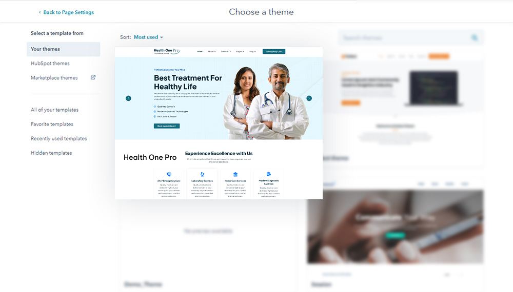
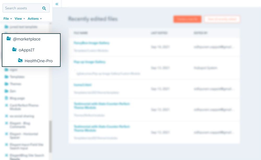
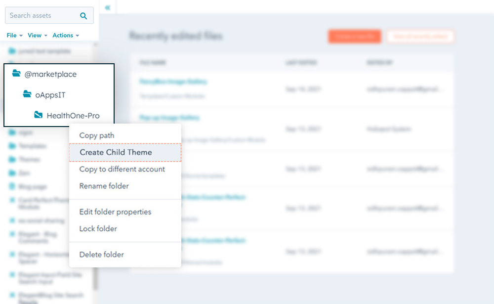
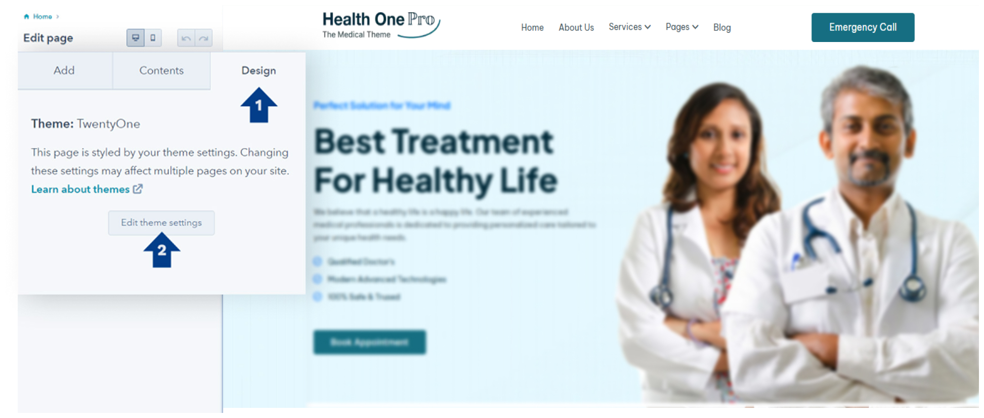
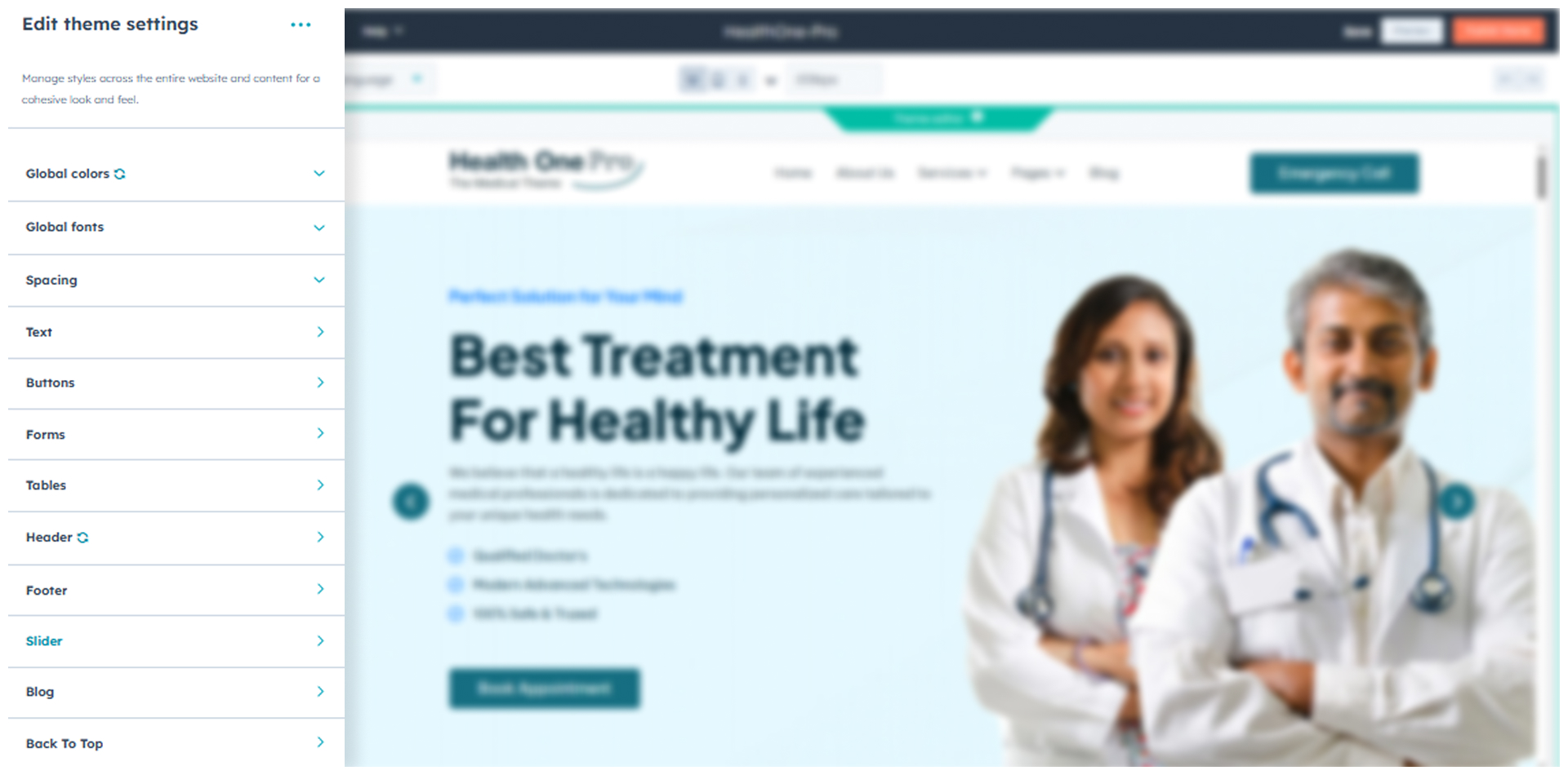
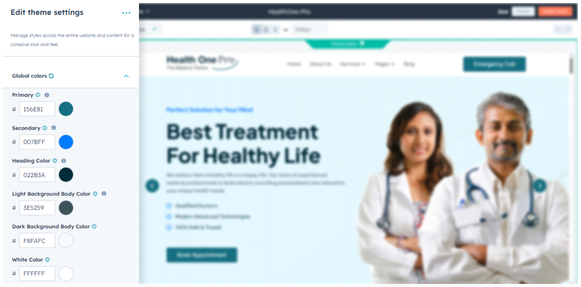
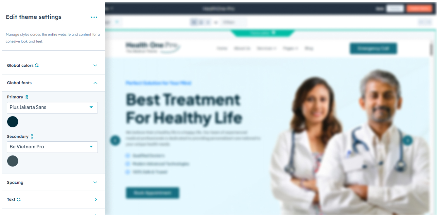
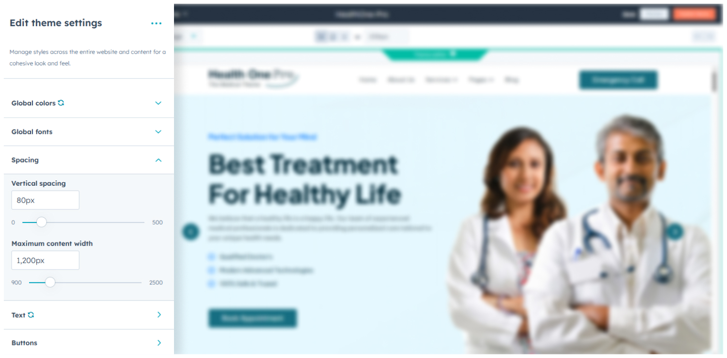
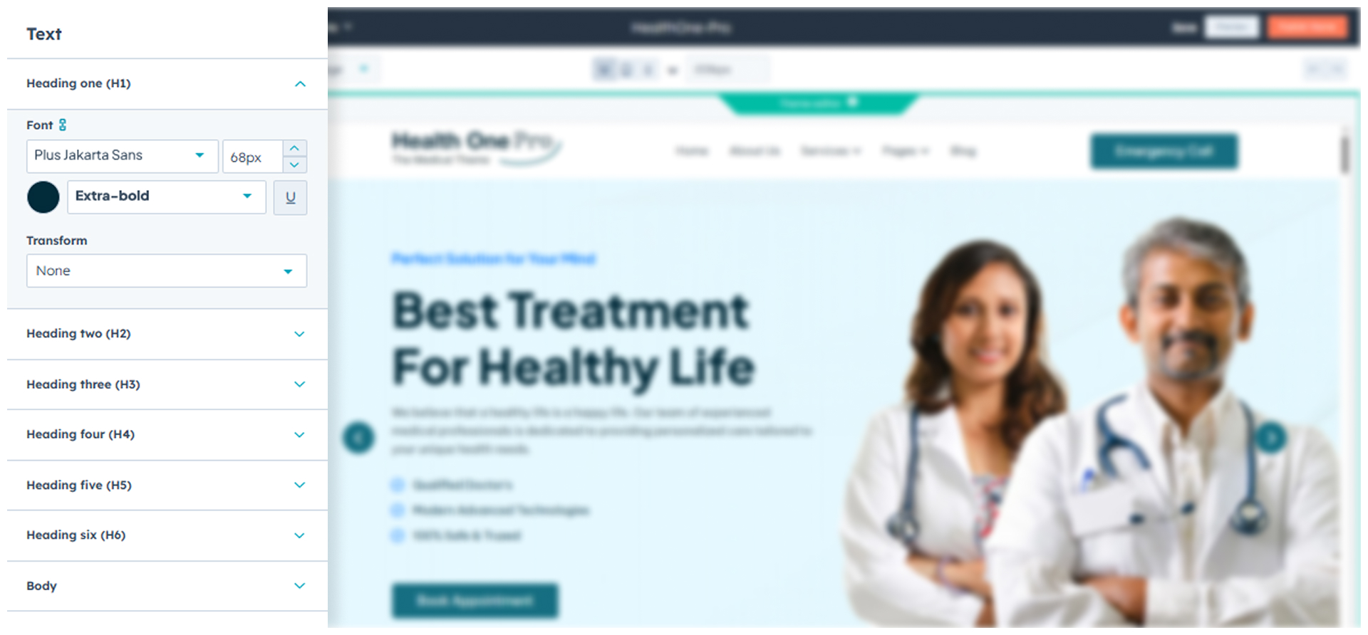
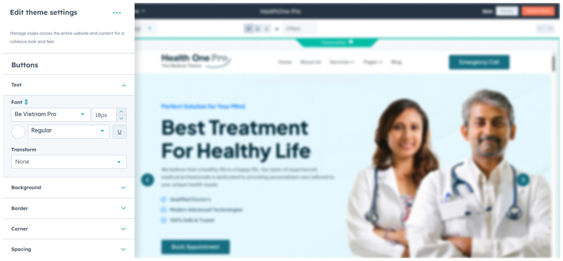
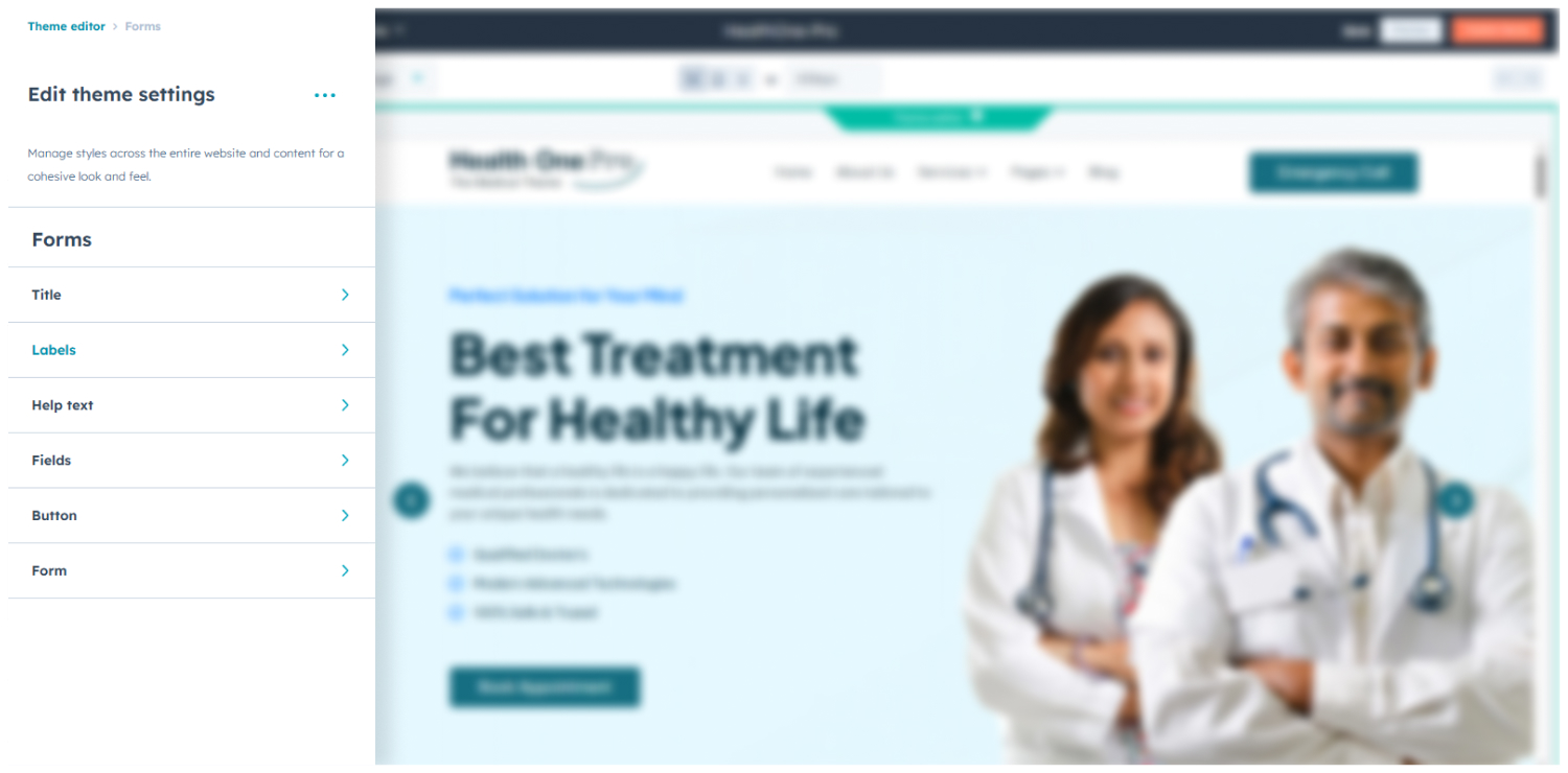
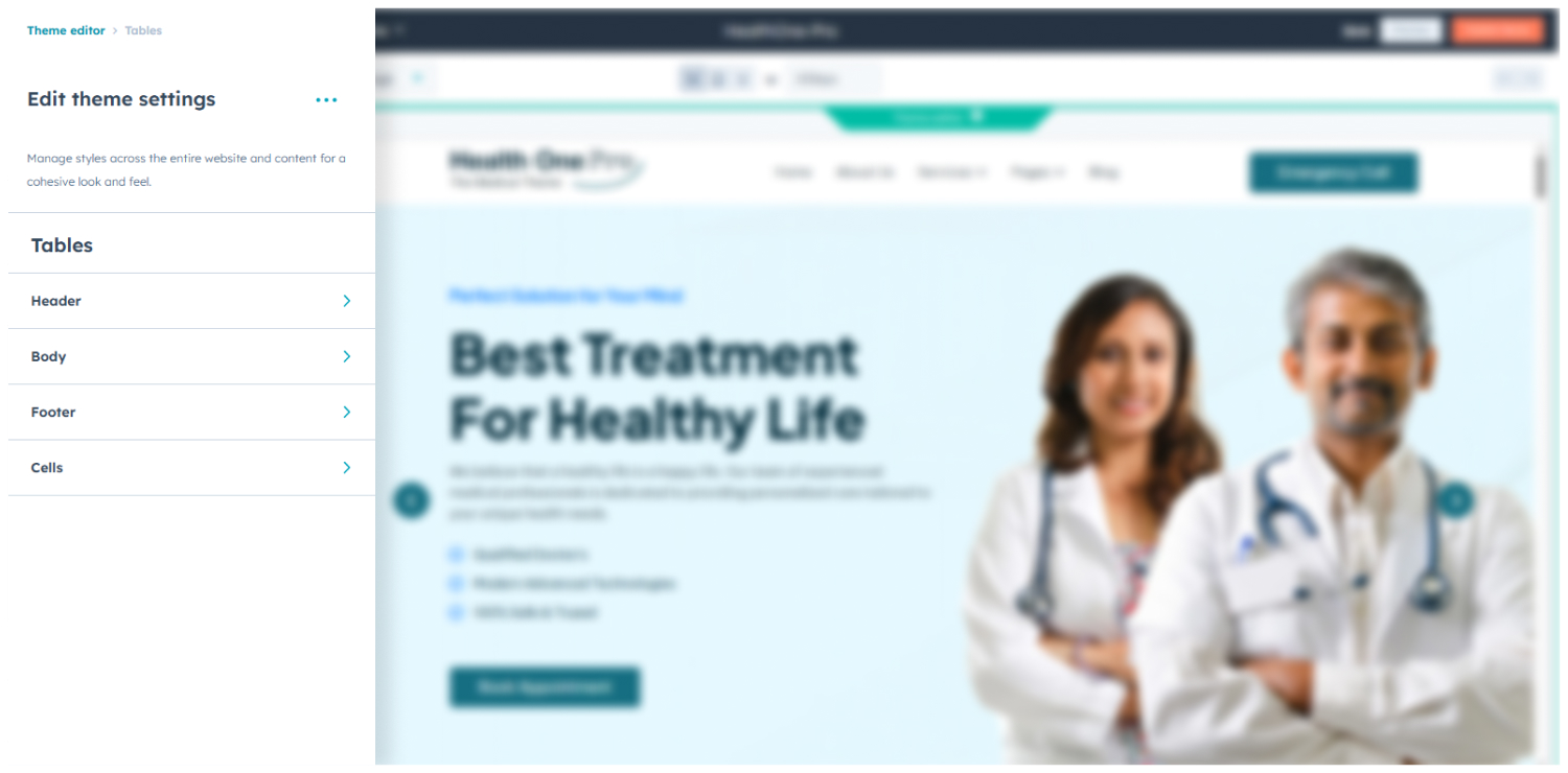
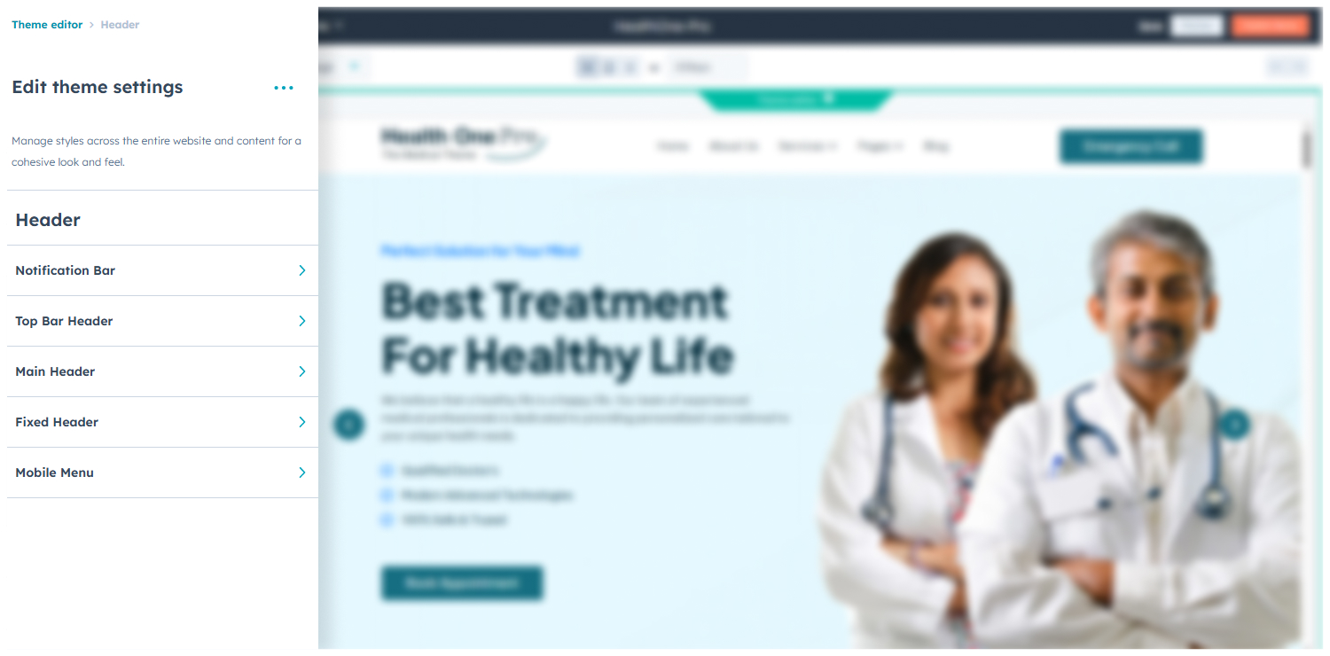
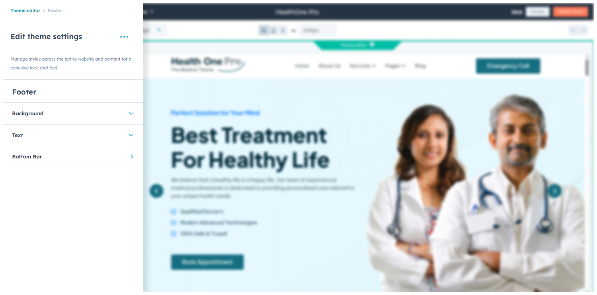
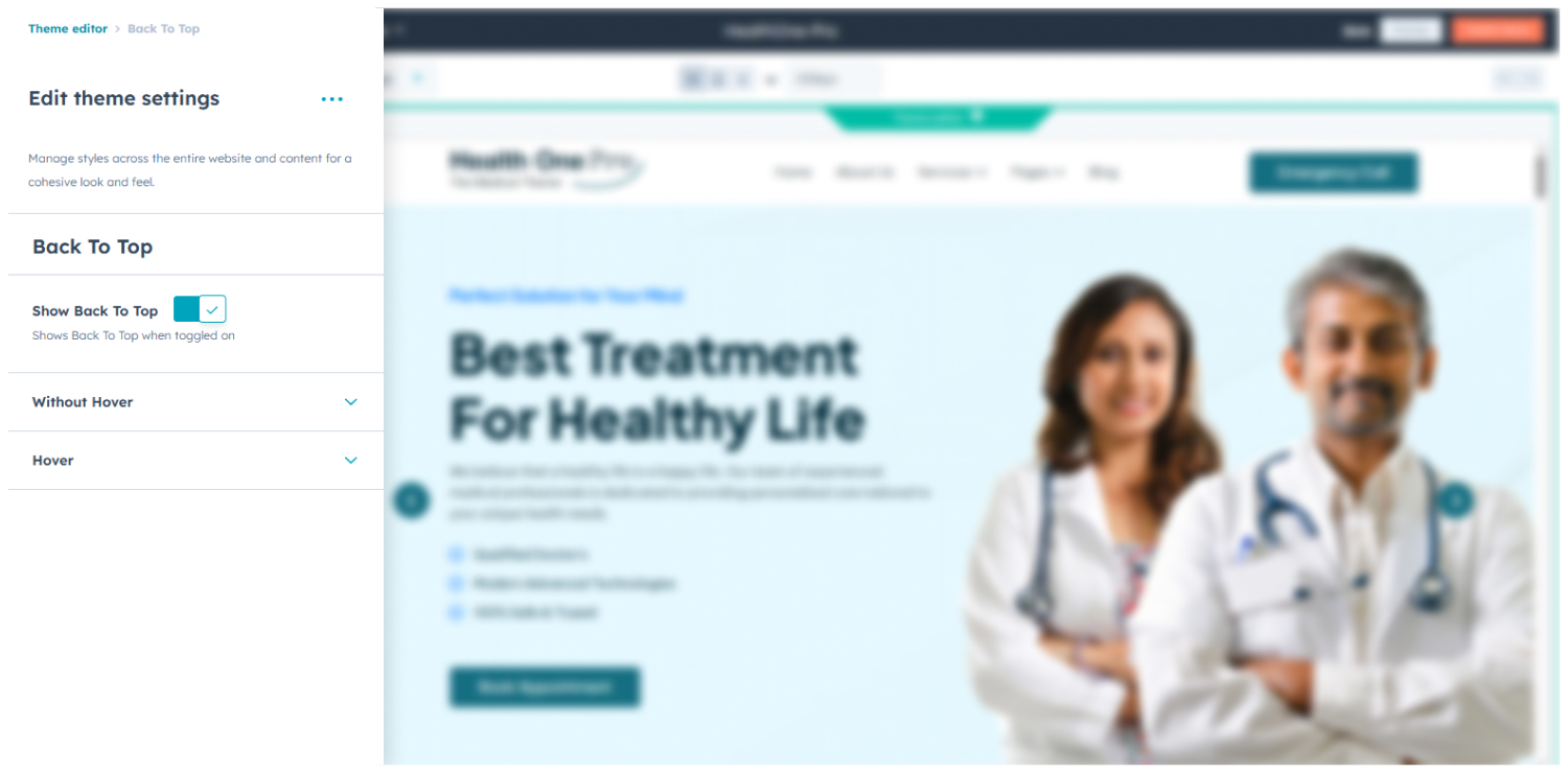
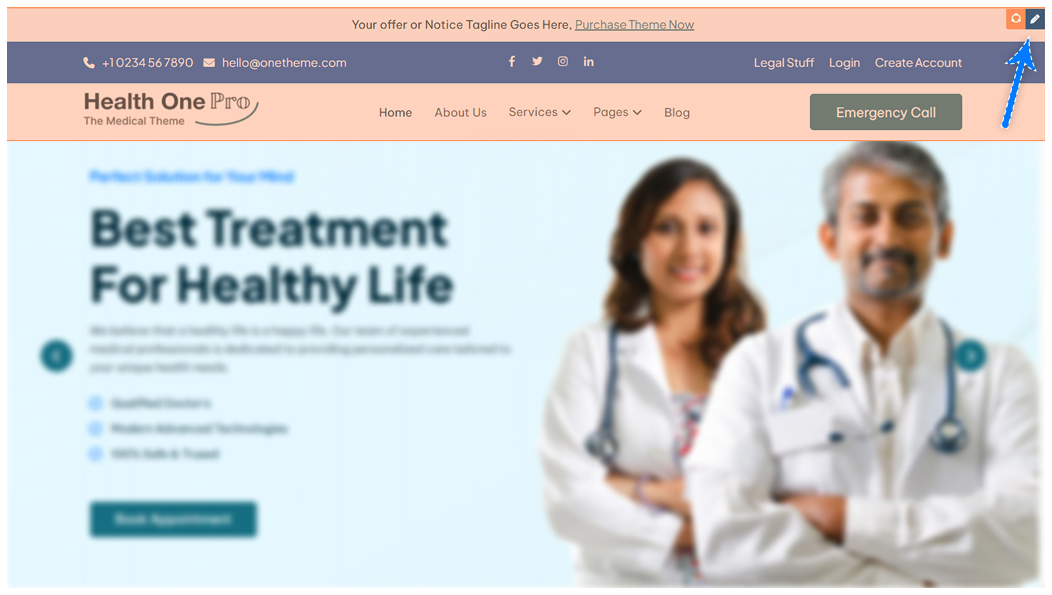
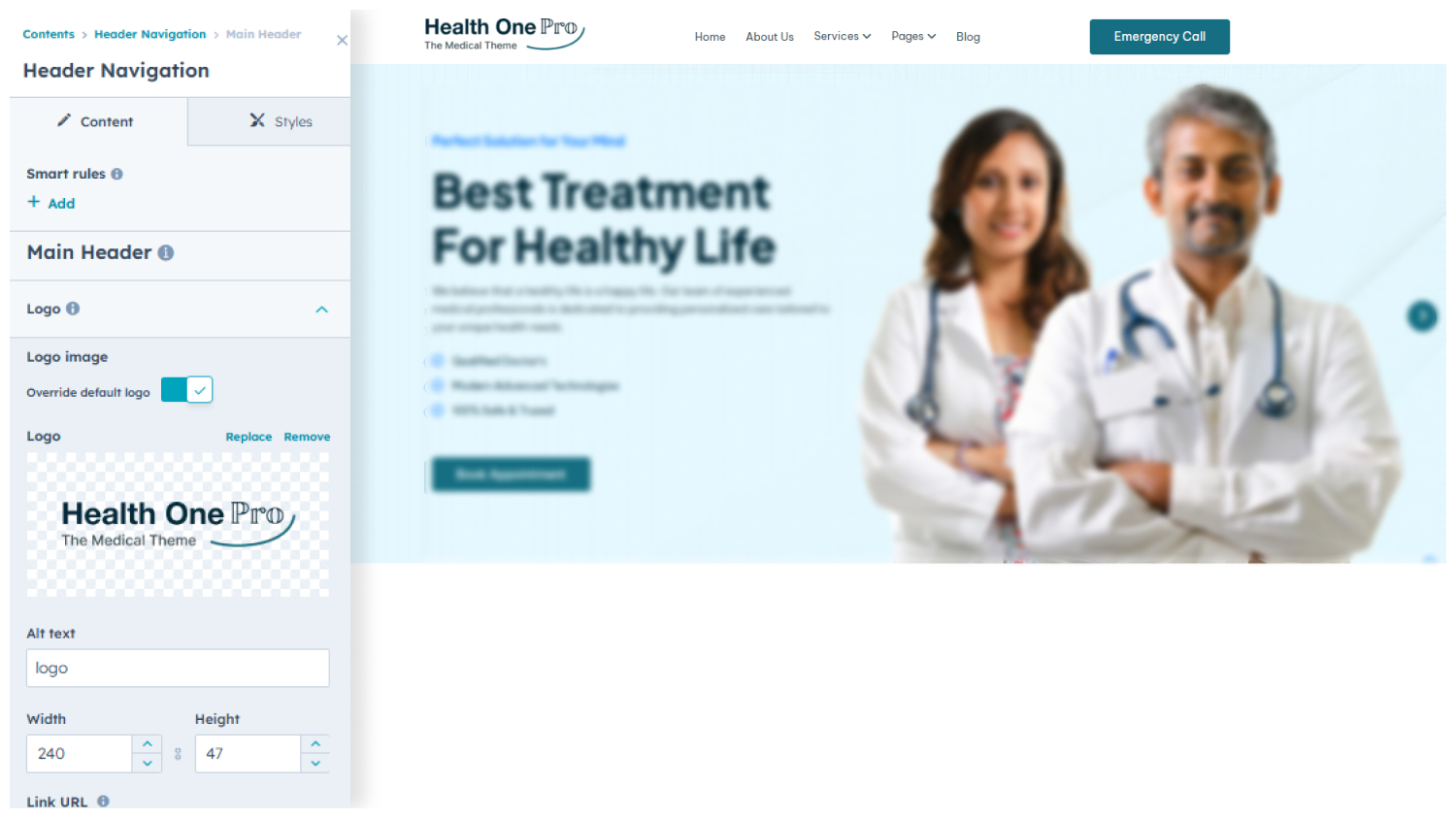
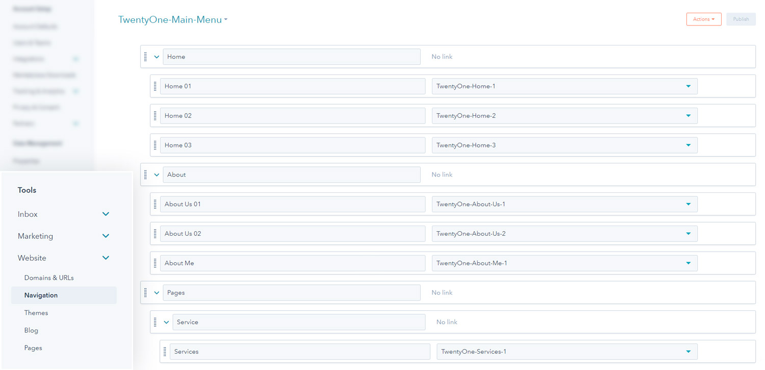
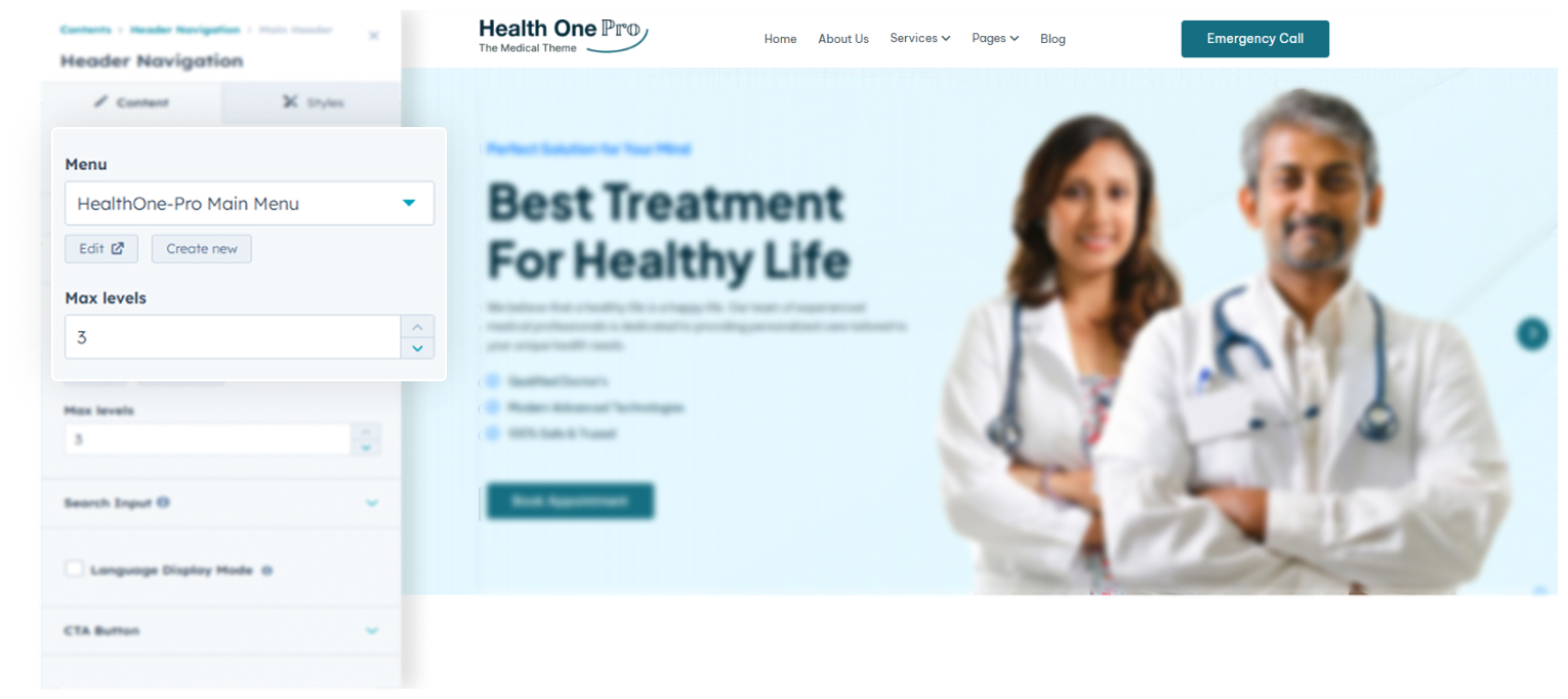
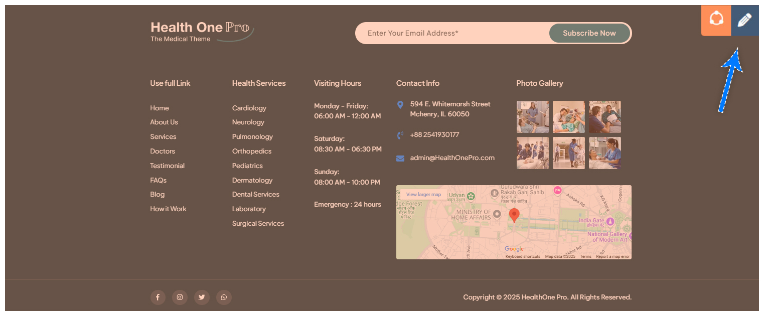
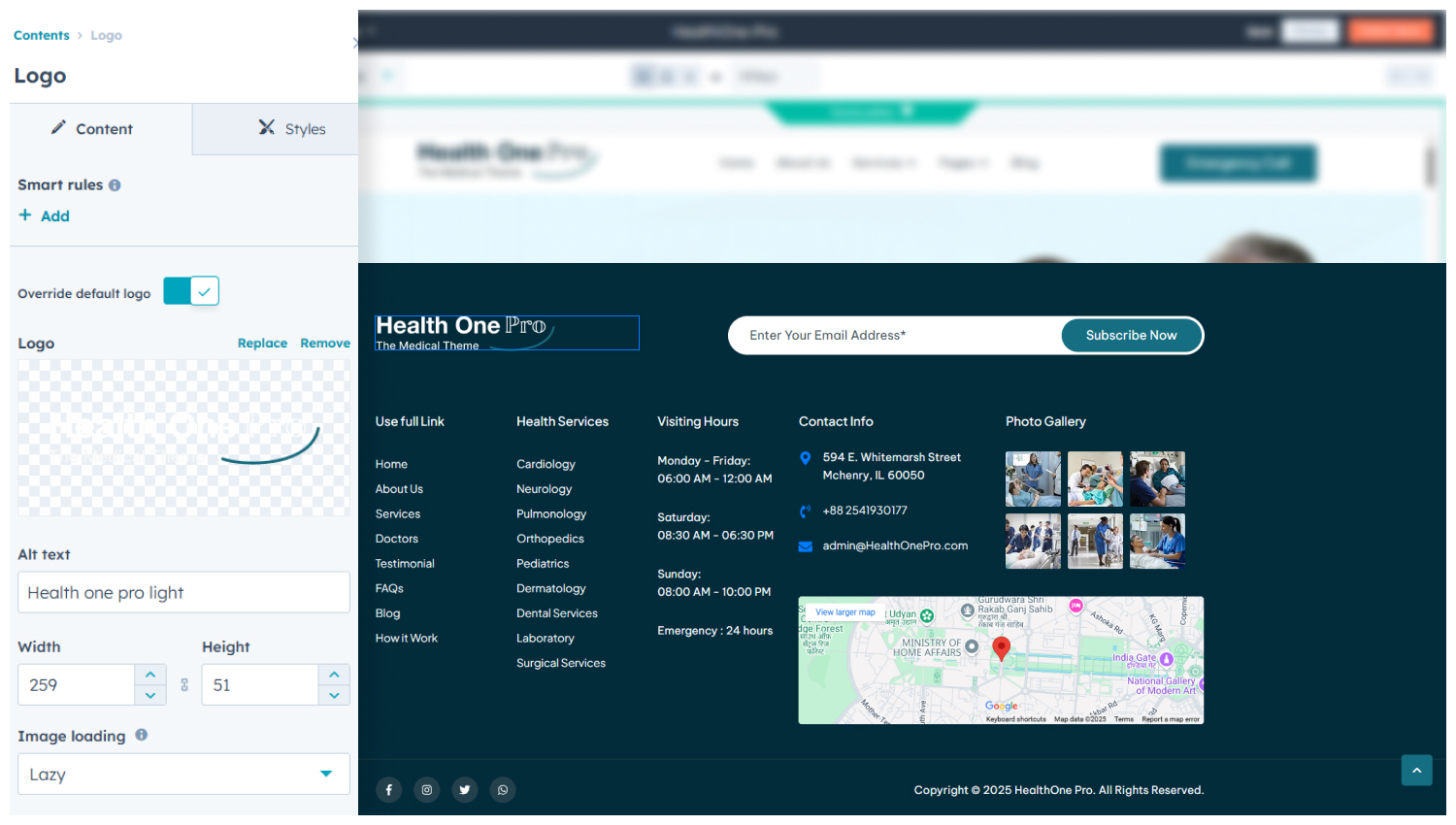
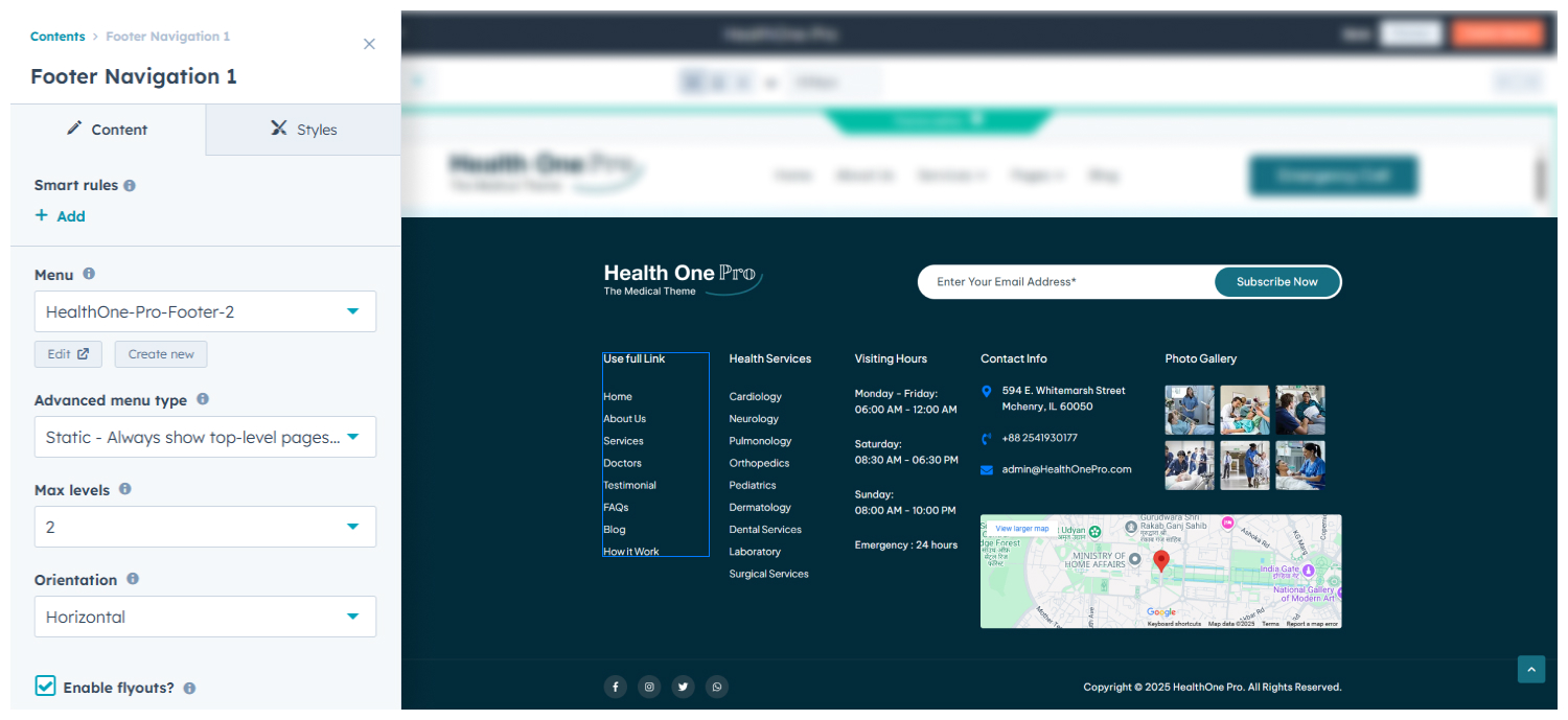
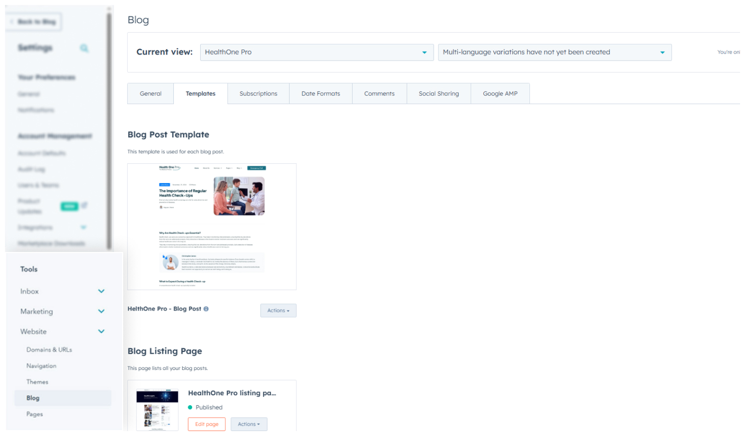
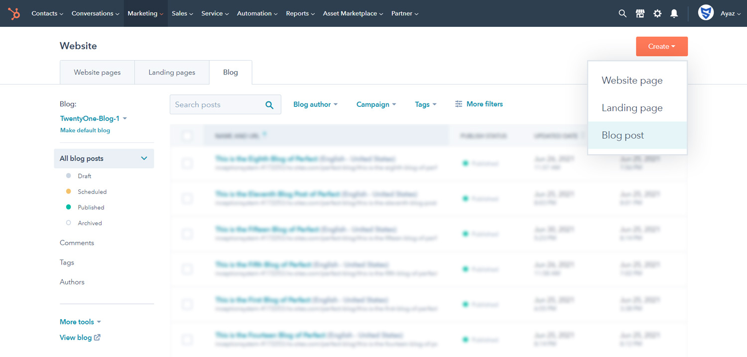
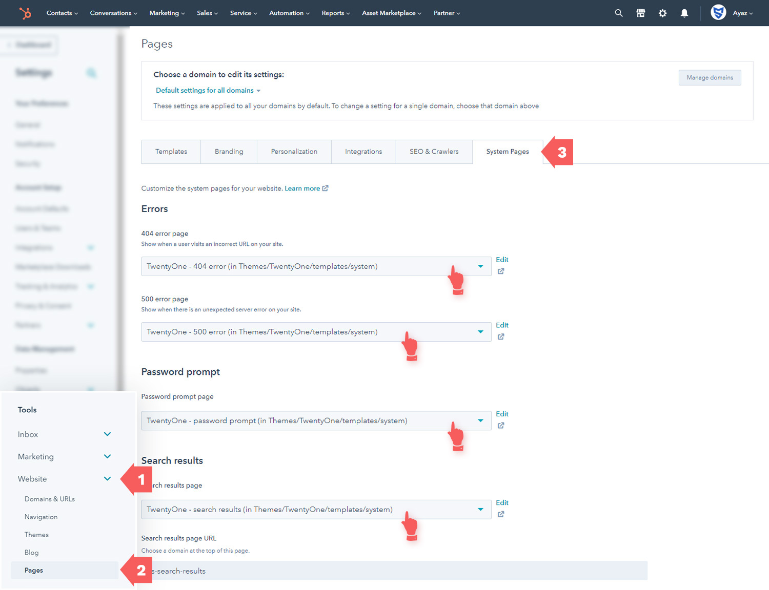

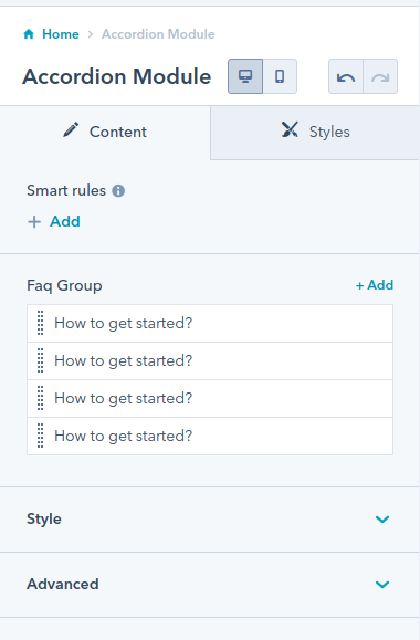
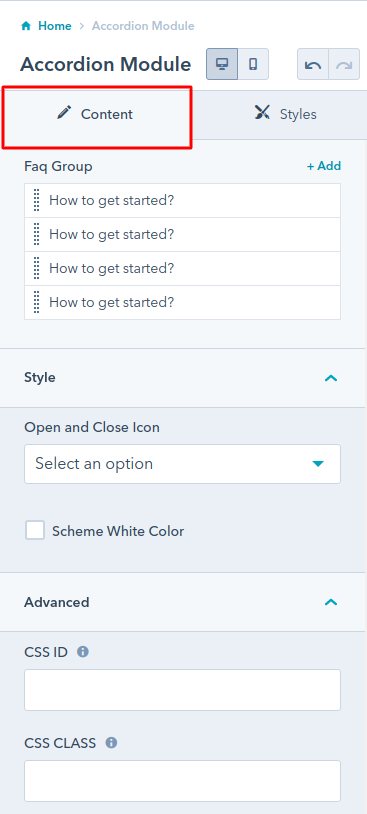
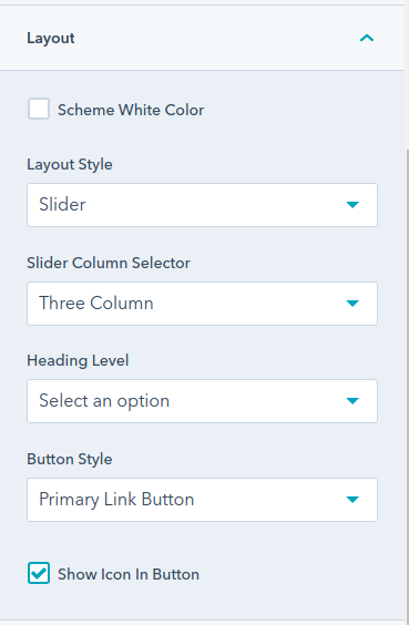
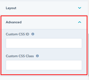
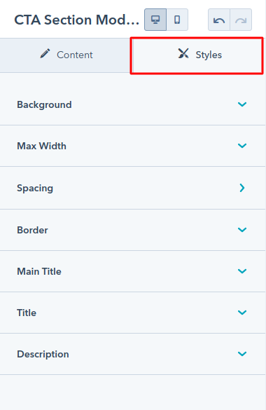
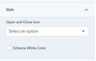
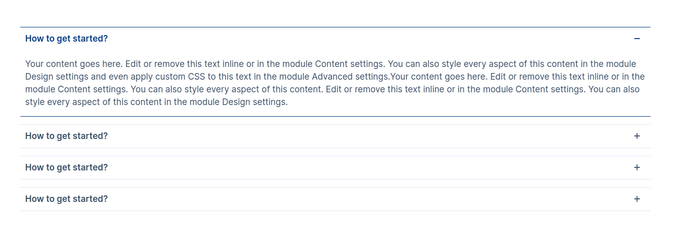
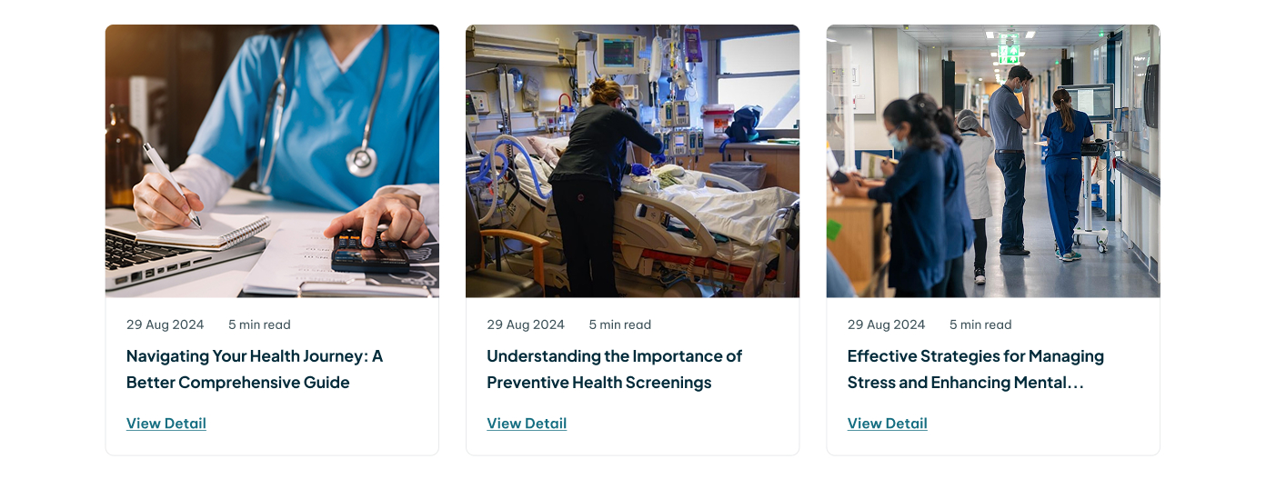
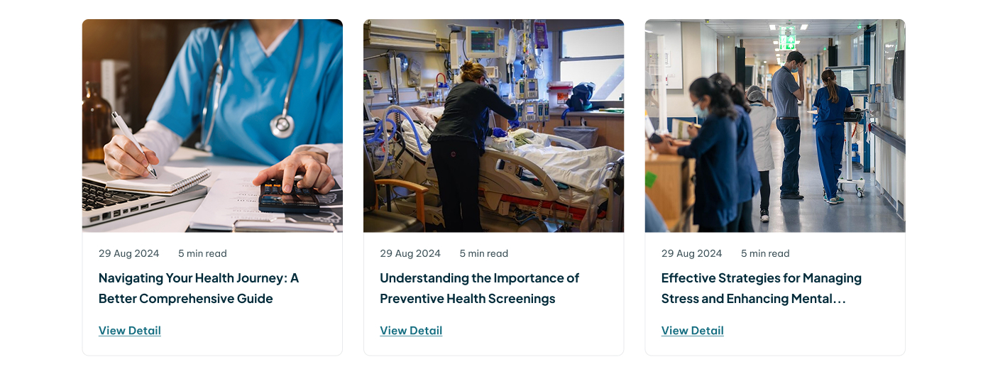
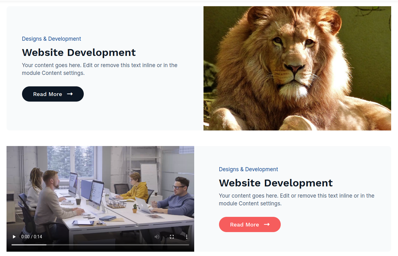

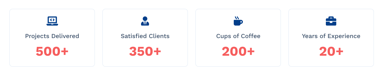
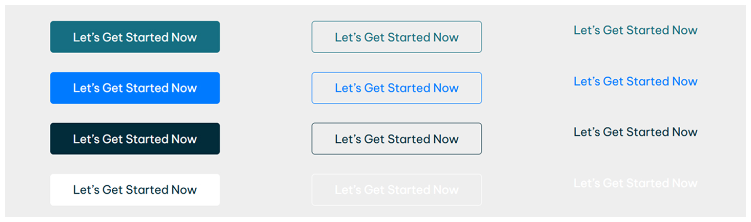





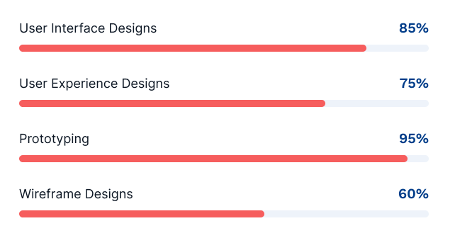
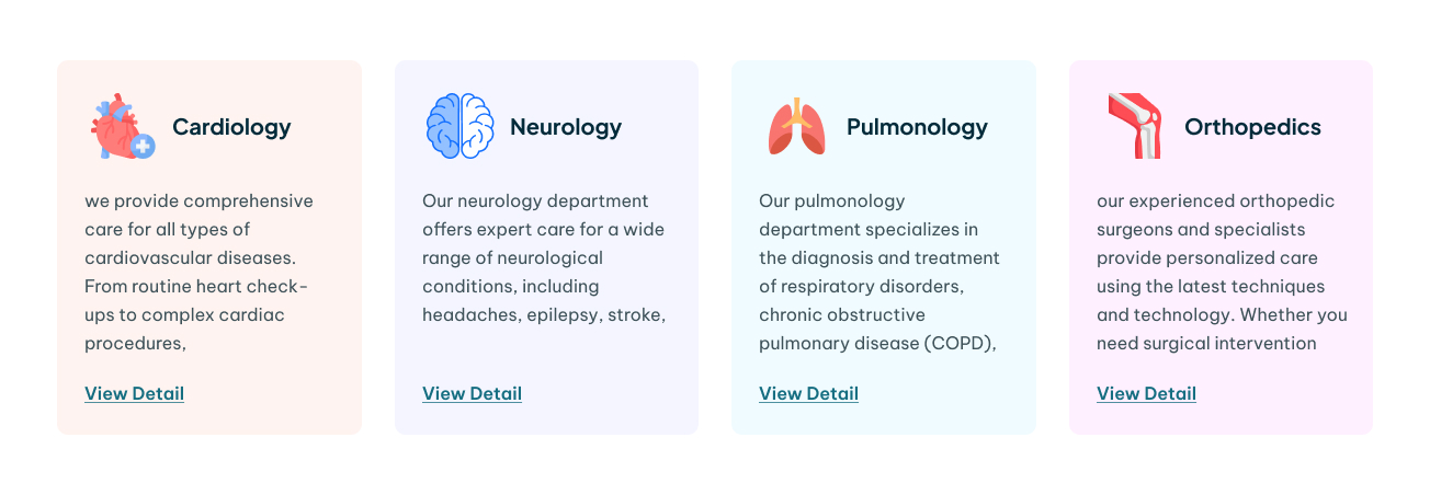

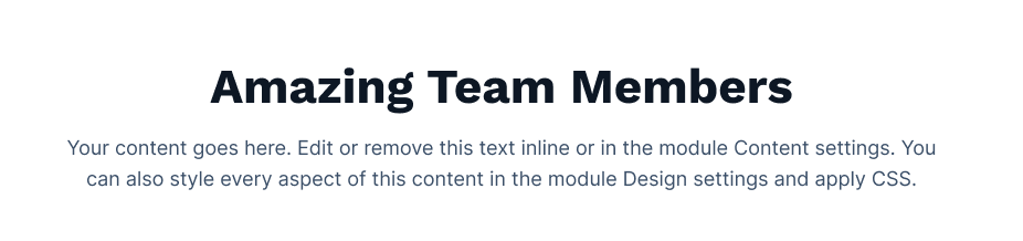

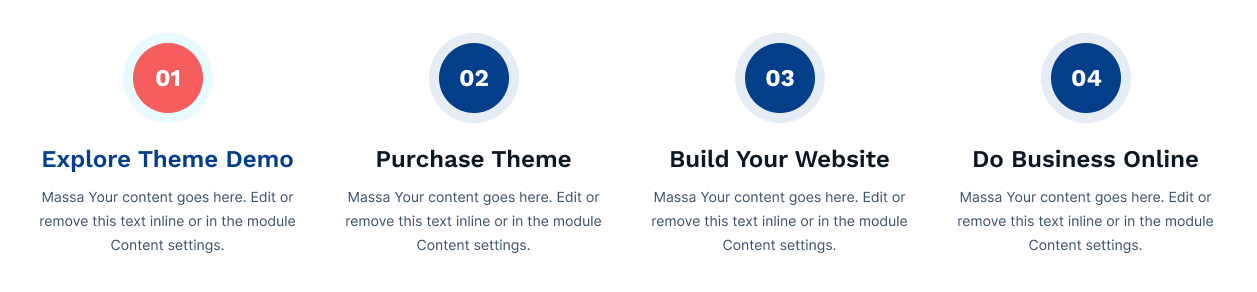
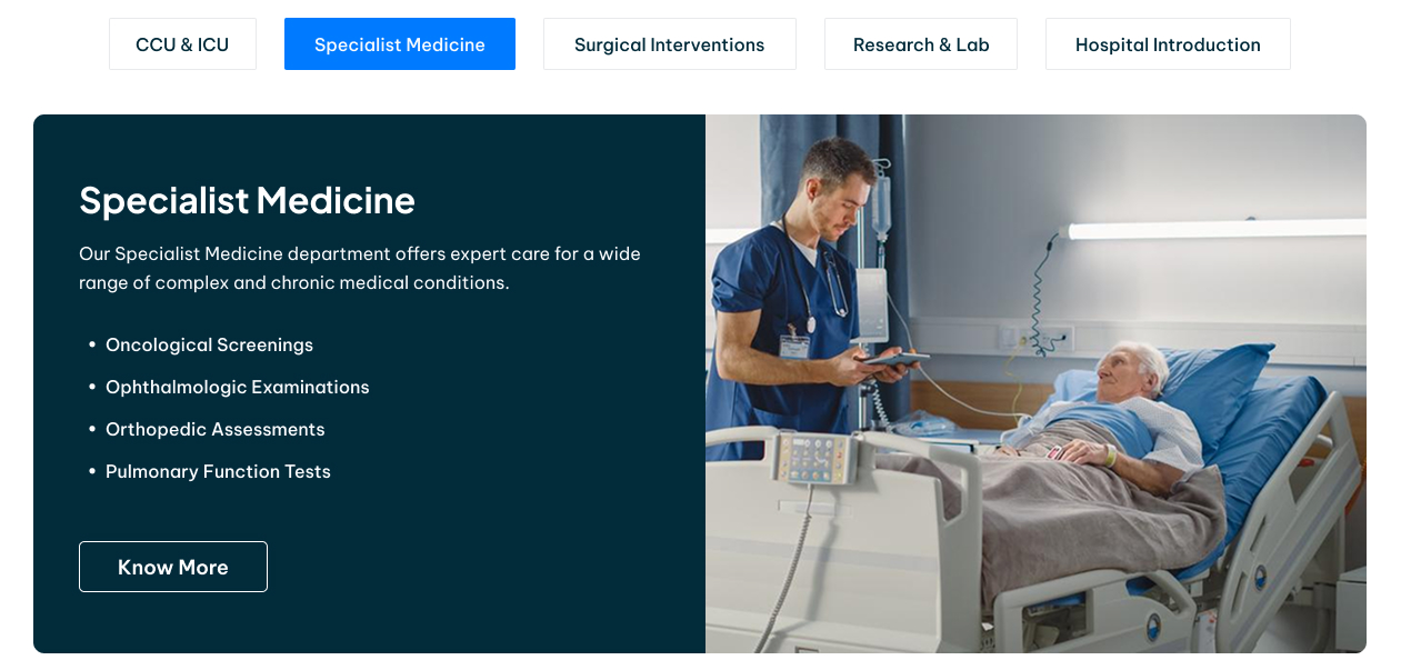



Social Follow
The Social follow module is used to follow or subscribe in the social media of your brands.
Content Section:
Style Section:
Examples